Most recently updated on October 07, 2025
ON HOW IT STARTED
Postmodern Tectonics:
First, music. And then light.
Specifically, finding a way for them to work together in one functional piece of furniture.
We noticed a lack of contemporary DJ furniture that was affordable, served a functional purpose, and maintained a true artistic craftsmanship. Living in LA and NY, we were shocked that a $76 Ikea Kallax Shelving unit was the best option for many at-home DJ set-ups.
Not to throw any shade at Ikea though!
We all deeply appreciated the high-quality custom projects coming out of the UK (e.g. JJ.Booth and others); however, we found ourselves frustrated with the inaccessible price points, especially in the US.
So we set out with the goal to bring Musical Furniture™ to the masses at an affordable price point with a versatile, modular catalogue of furniture parts.
We acknowledge this first case study has not fully achieved the affordability side of things — yet! — but it is without a doubt our intent for future iterations.
In order to blend the never-ending debate between form vs. function, we joined forces with the incredibly talented Casa Ysasi studio in Los Angeles. Pato and Inigo share a common appreciation for artists such as H.C. Westerman and Donald Judd and their ability to blur the line between furniture as sculpture, or sculpture as furniture.
The line was not always clear and that’s exactly what we love.
Our collective goal was to bring these two star-crossed lovers together, while turning an otherwise utilitarian object into what we all believe could also be viewed as an art piece – CASE STUDY 01.
We provided the function – they provided the art.
And it worked seamlessly.
ON INSPIRATION & MATERIALS
Casa Ysasi:
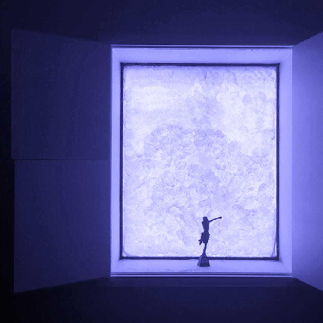
We’ve always been fascinated by the Light and Space movement and artists like Robert Irwin that expanded the idea of what light and space could mean for an environment. Their work showed us how perception itself could be a medium. But what we felt was often missing was the spirit that music brings. The sense that art is not only about structure or perception but about chasing a feeling.
Music was our first entry point into art, and we try to carry that same sense of discovery into the objects we make. The goal is for it to move you on an emotional level.
When we collaborated with Postmodern Tectonics on Musical Furniture, the concept embodied that ethos so perfectly.
Postmodern Tectonics:
If you have ever read Bachelard’s “Poetics of Space,” then you may share the same appreciation for a window from within a room. At POMO–TECT, we adore James Turrell’s ability to draw everyone’s attention to one profound “window,” or void, in an otherwise empty space.
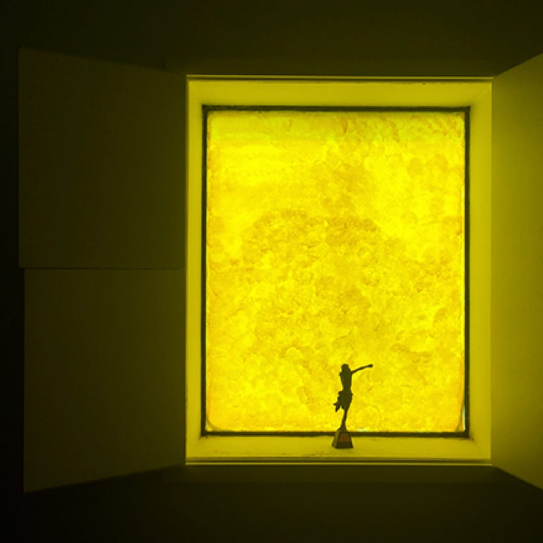
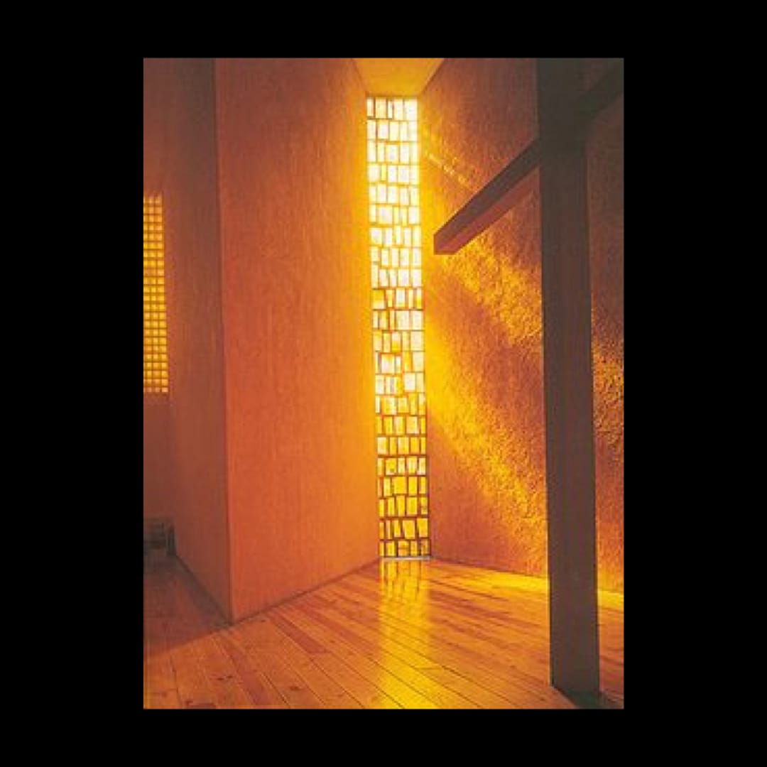
Our collaboration with Casa Ysasi on the credenza and the rest of their light sculptures grew from a collective appreciation for the work of Luis Barragan and more specifically, his masterful ability to use “cheap” or affordable materials, like yellow paint on a window and texture on a wall, to control one’s feeling within a space.
For example, Barragan would say a yellow window into a living room evokes “spiritual warmth, joy, and contemplative serenity.”
Casa Ysasi harnessed that exact feeling of natural warmth and deployed it across many of their light installations – a feeling that can only be captured using their quintessential Amate paper sourced from Oaxaca.
As living costs rise and living rooms grow smaller, our CASE STUDY 01 was conceptualized around the Vitruvian idea of the hearth – the focal point in the earliest and most human space of gathering.
In simpler terms, our goal was to design a contemporary grand piano which simultaneously produced a warm, fiery glow that mimics a fireplace - combining both music and light.
When was the last time someone could fit a Steinway in their apartment...why not buy a DJ booth instead?
ON FUNCTION MEETING FORM
Postmodern Tectonics:
Our name quite literally means a distinct break from existing dogma in the art or science of construction — Postmodern Tectonics.
This is how we approach solving practical needs throughout our work.
We deconstruct the problem down to its very foundation, understand all of the existing approaches to solving said problem, and then reconstruct a clear path using a scientific approach to solving the problem with artistry and craftsmanship at the helm.
This is precisely why we built the credenza together with Casa Ysasi.
In our view, we strongly believe that the only thing that turns a piece of furniture into something experiential is how the user interacts with it.
We deeply appreciate how Olafur Eliasson has prioritized the same concept throughout his work. He thinks scientifically, artistically, and experientially.
While the credenza may or may not be at the same scale of his installations, the only way for someone to understand it is to simply walk into the space and experience it.
Olafur says that “we create reality as we go through space” and all of his work is completely dependent on the “spectator.” This deeply resonated with us as we simultaneously try to manipulate light and sound in Musical Furniture.
“What makes a space tolerable or inclusive? The body is a good indicator. Who knows about the body? Dancers.” -Olafur Eliasson, 2018

With a very similar logic, our collective goal was to create a furniture piece that MAKES PEOPLE DANCE.
As we always like to say: more dance, less talk!
ON THE COLLABORATION
Postmodern Tectonics:
Absolutely.
Our primary goal at the very beginning was to solve all of those painstaking problems a DJ experiences when they show up at a new venue...
Nowhere to hang their headphones.
Nowhere to put their beer without risking a spill.
Difficulty seeing the records they’re about to play or even display the records they’re currently playing.
For these precise reasons, we applied a scientific attention to detail – down to the millimeter – when setting out our dimensional constraints for variables such as record storage, drink storage, and everything else. These very simple variables are constantly overlooked and it's frustrating for DJs – and musicians of all types.
In the long run, we aim to design objects for all musicians, whether you’re in a quartet or play the clarinet or just need a new piano bench – we want to build beautiful furniture that supports everyone's love for music.
It is our absolute goal to make Musical Furniture™ an ongoing, collaborative series.
Postmodern Tectonics and Casa Ysasi could not be more proud and excited to be working together and can’t wait to show everyone what's coming next.
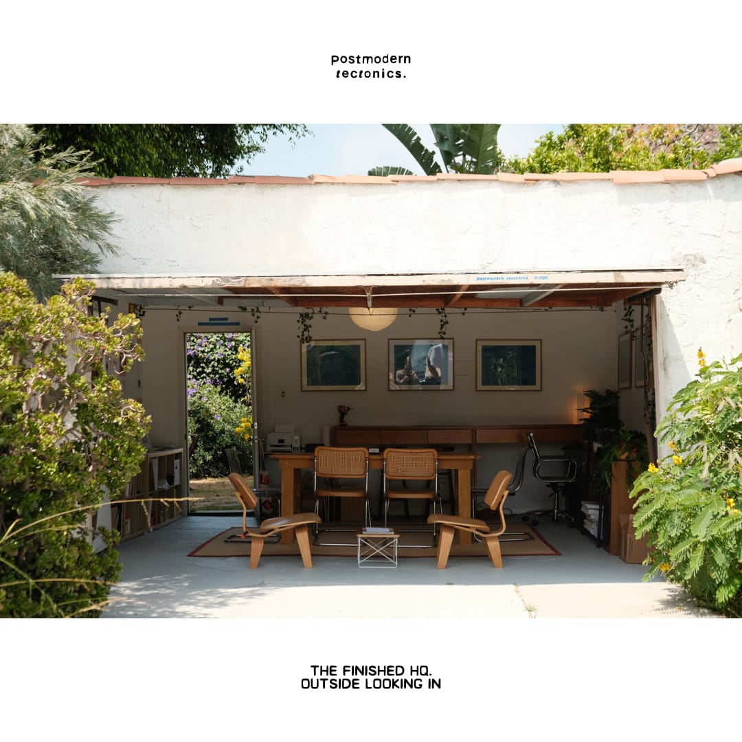
Growing up as a company is way more fun than growing up as a person.
It happens a lot faster (hopefully), and it's far more linear and compounding — small wins lead to others and before you know it, if you're careful about your costs and make things that people want, you're in a place where you can start thinking a little less about now (operations and product) and far more about the future (the kind of company you want to be).
And we've always wanted to design far more than products — a great company is part of that.
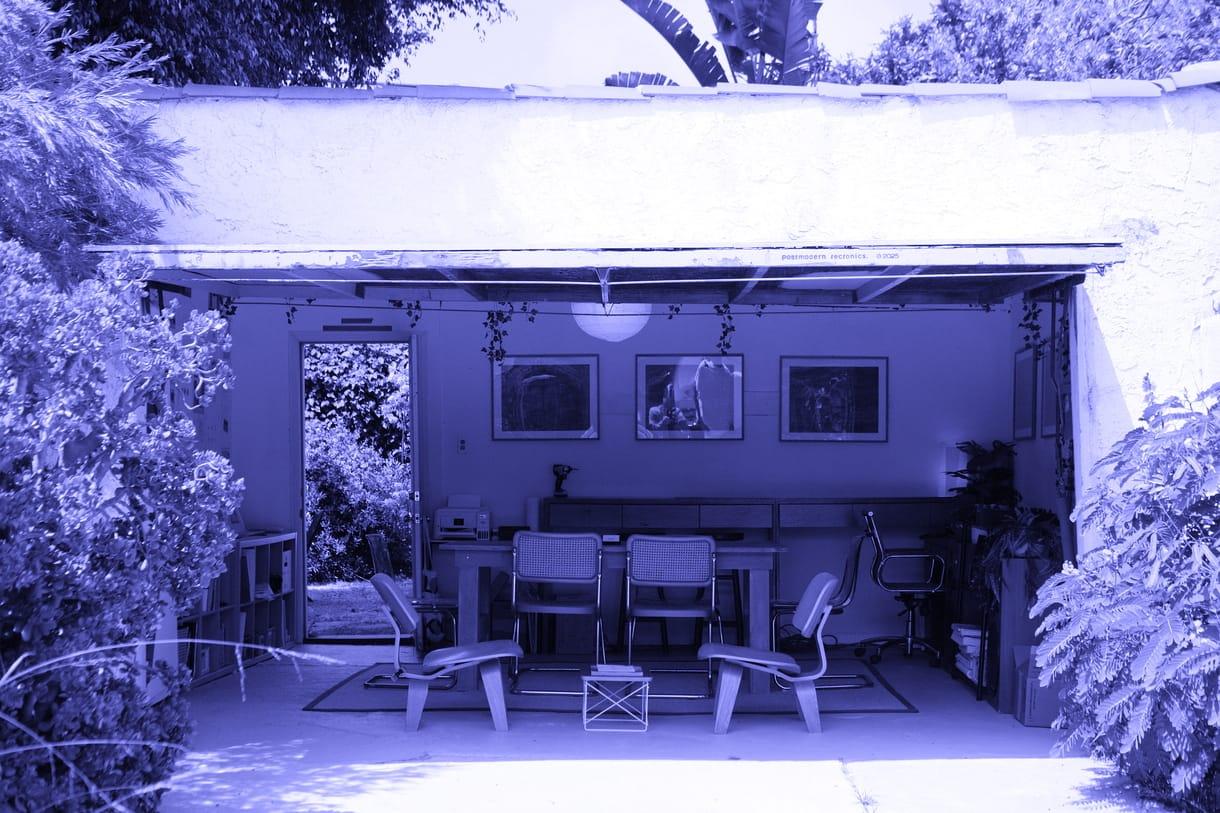
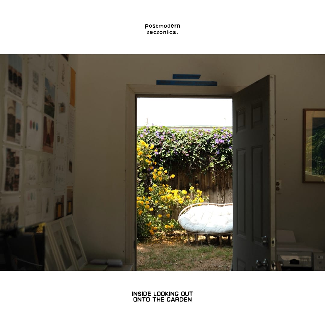
So over the last few months, we decided to reinvest in ourselves by designing and building our first space to call home.
These were the principles that guided us:
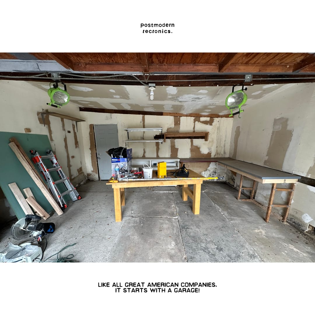
Garage as crucible.
As we've been building this thing out, we couldn't help but be reminded of all the original garage startups in California, the Apple's and HP's of yore.
The concept of the "garage startup" is perhaps one of the most important ideas in modern American business.
And although we're decidedly not a tech startup, we intentionally wanted to re-capture that spirit and aesthetic, which today seems lost to shitty, faceless co-working spaces.
A working studio, store, and hangout all-in-one.
One of our goals is to bring consumers closer to the production of the goods that they consume.
We mean this literally and figuratively.
Literally in the sense that we find the aesthetics of great studios — in design, architecture, art, advertising etc. — to be of the highest aesthetic order. (We'll write more about our favorites in short order). They're endlessly fascinating — messy, chaotic, sometimes loud, but also beautiful, serene and the kind of place where, in a world full of talking and posturing, shit actually gets decided on and even made.
And figuratively in the sense that we think too many retail experiences today are too sanitized — "world building" has become the de facto approach, vs. trying to connect customers to the designers in the space and time that actually made the thing they're buying.
Sure, you probably don't want to walk by a CNC machine in full operation to buy a tee, but maybe a drafting table?
We'll start there.
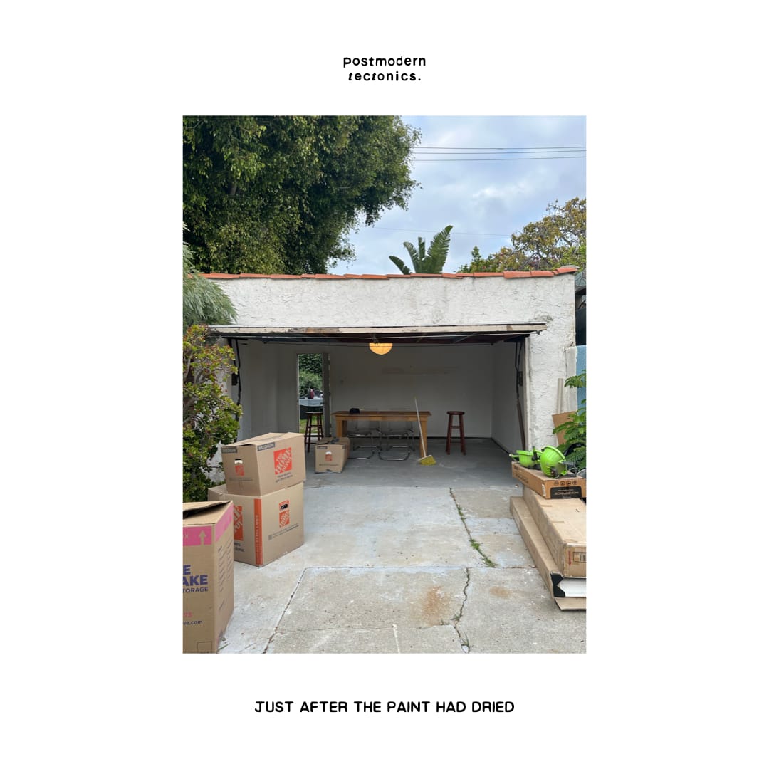
An ambience of honesty.
Some of our favorite experiences in the space thus far have been showing friends and family around — letting them see our work in full flow, in a warm, communal space that doesn’t create any expectations or try to project something artificial around who we are and how we operate.
It may be our “office” but it should never, ever feel like the dictionary definition of office.
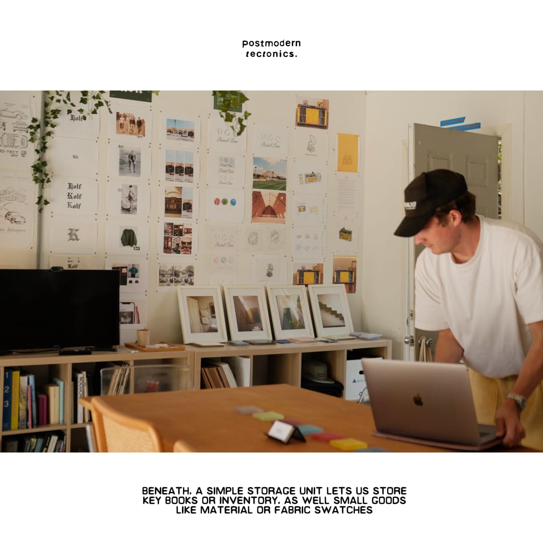
A literal hand in making.
Everything we've made and achieved thus far has been carried on our own back — of course with a huge amount of support from early friends and family like you.
So we wanted the studio to reflect this...
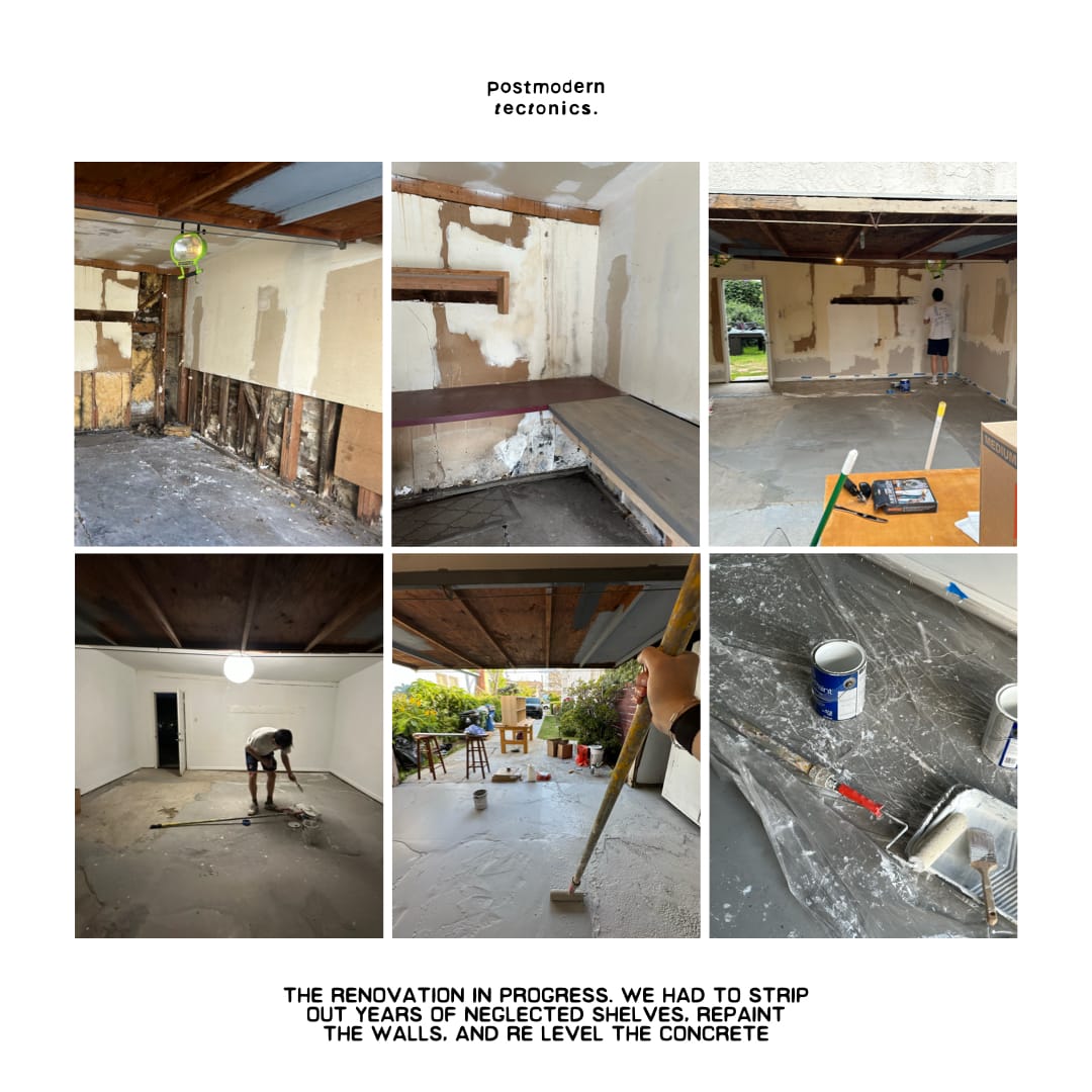
We leveled the floor and poured the concrete ourselves.
We painted the walls, hung the art, designed our own objects where needed, and generously sourced furniture from our close network.
A handmade feeling is crucial to us — analog spirit — so we wanted our first space to embody that.
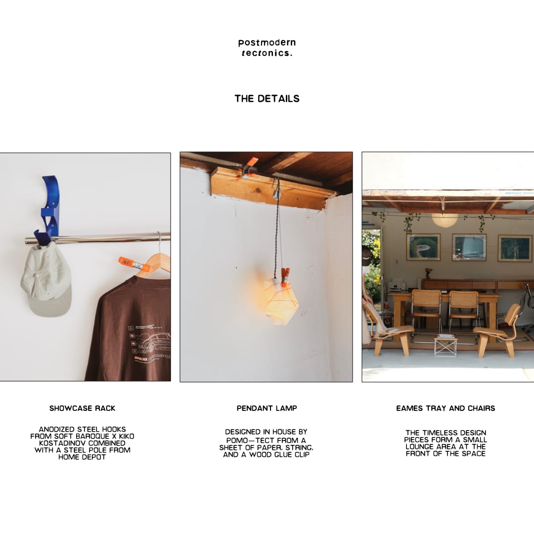
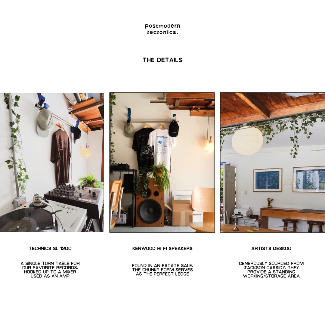
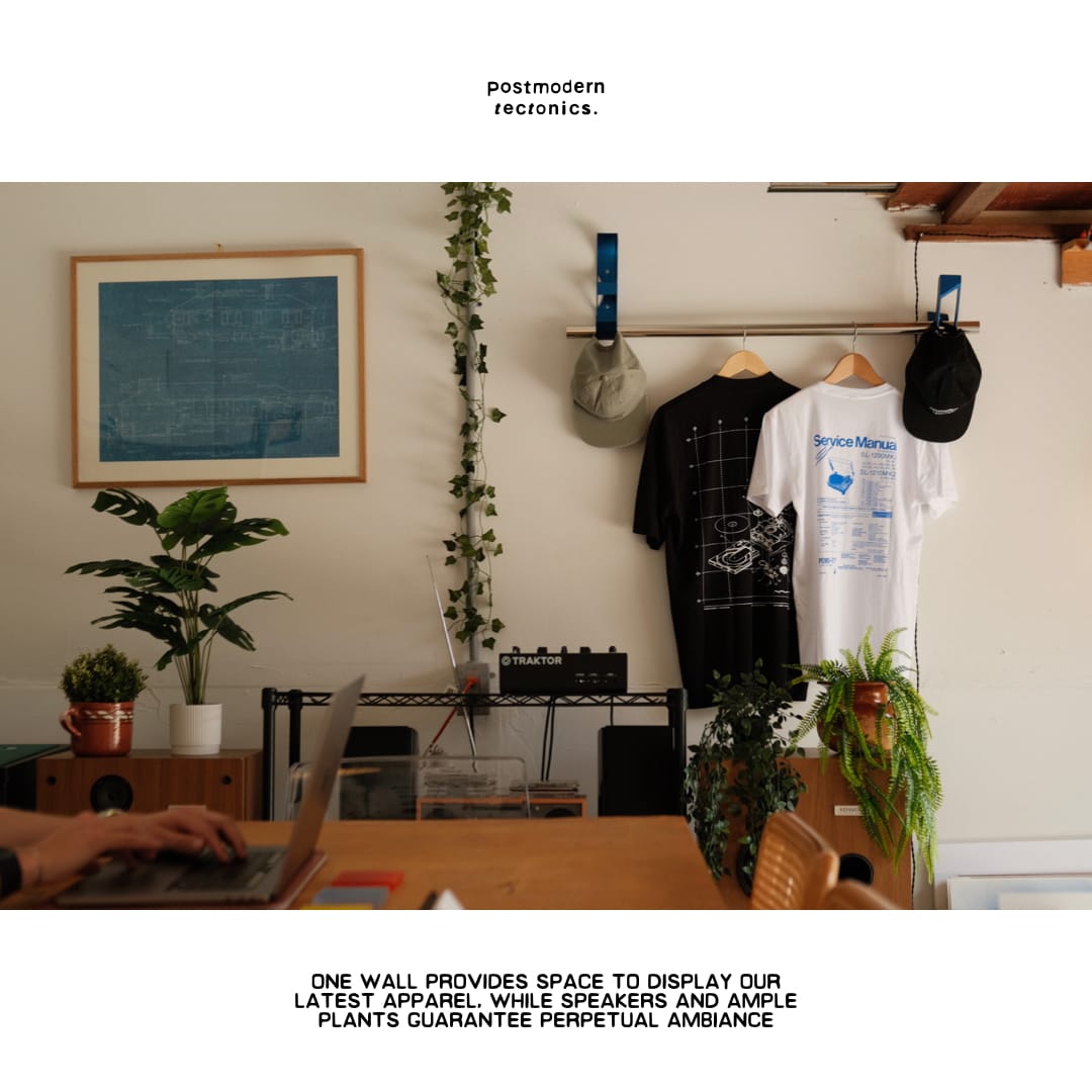
Permanently semi-permanent.
Everything we've bought or designed for the studio is designed to travel with us wherever we find ourselves in the future.
Hopefully the only way is up.
But landlords are fickle, the economy is crazy, so portability is key.
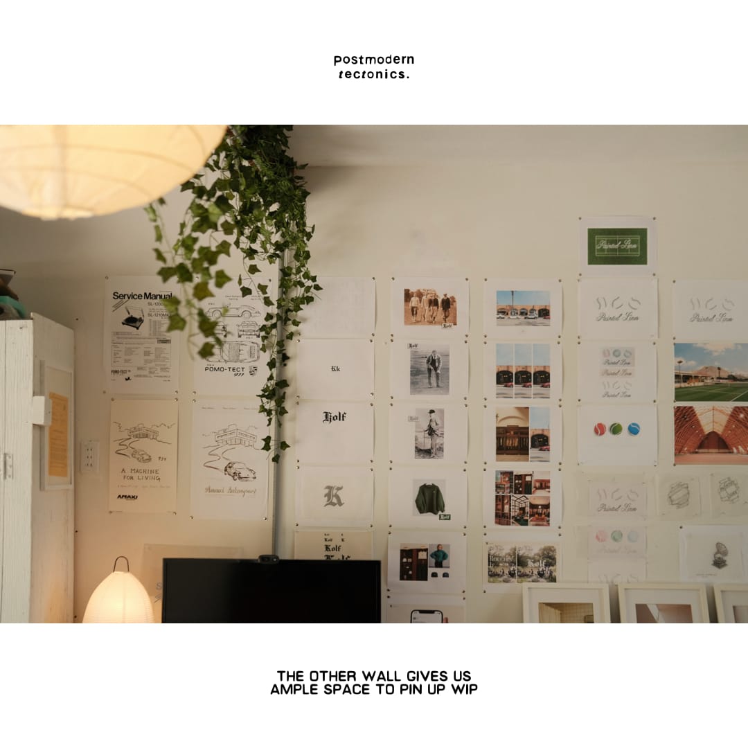
Los Angeles, not New York.
We've always viewed New York as our intellectual home.
But LA has always been our actual, operational, and spiritual home.
It's just so much easier to transport, mail, make, and live an indoor/outdoor studio lifestyle here. It's not even close.
It's also where the lion's share of our clients and collaborators live and work right now.
Someone once said that New York is for the mind and California is for the body, and that's largely true — the crucial point being, you need both in your life to some degree to be truly alive.
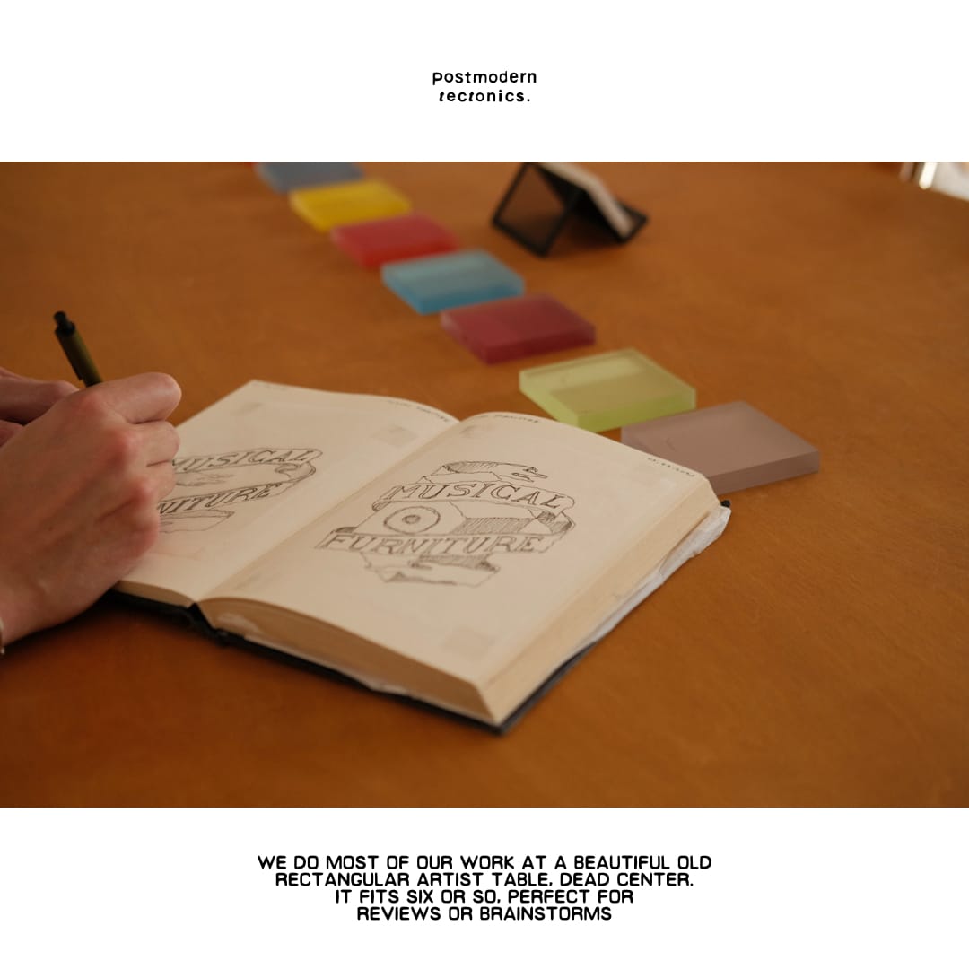
No. 15: NON VOLATILE STORAGE MEDIUMS: THE BEST WAY TO CONCEPT IS THE FASTEST
When you make things for a living, ideas are precious. They're also incredibly pesky. They come to you right before sleep, in the shower, walking down broadway, almost always at some point when the last thing you thought you were going to have is an idea.
Documentation of these specifically and keeping an archive generally, is critical to the creative process, especially when ideas are in their infancy. We wrote about this at length in APPLIED IMAGINATION.
But capturing fleeting thoughts in today's world can feel like something between a full tech stack and another day job.

We’ve found — through trial, error, repetition, and multiple cancelled Notion subscriptions — that the best way to take notes is the fastest. Not the prettiest. Not the most organized. Not the kind your future self will thank you for. But the kind that doesn’t ask for permission and has been there since the days of our cavepeople ancestors — a writing instrument and a surface.
Writing by hand or on paper, or on receipts, or in the margins of a printout you no longer need is, strangely, less rude in meetings than typing. You don’t have to stare down into a screen, or angle your body behind a rectangular shield. You just write.
It's like thinking out loud in total silence.
You're not limited by trackpad and keyboard — you can free form notes, write anywhere, link thoughts together with lines and quick diagrams.
And then you can sketch and prototype out what you mean and just show people!
Not everything is best described in words. Sometimes what you need is a squiggly line pointing to a square. Sometimes the answer is a diagram, not a sentence. A fast sketch has a way of clarifying intent that two paragraphs in Google Docs will never quite reach.

As you know, postmodern tectonics is medium-agnostic. We sketch, we scan, we move to layout, we add grain, we print it out and scribble on it again. It’s not romantic, it’s practical. It’s also emotional, chaotic, nonlinear, and occasionally profane. The important thing is speed. Capture it before it floats off. Think with your hand, not just your head. Because most ideas do not arrive with a timestamp. They show up whenever they want, unannounced, at your brain's door, and they are HUNGRY!
One of the sad truths about making things — and design in particular — is that you have to try a lot of different options. Design requires trying a lot of bad versions before you land on something tolerable. And while a lot of folks have workflows and systems and perfect file naming conventions, we’ve found that those usually show up after the idea — not before. In other words, you can organize once it’s real. But first you have to catch it.
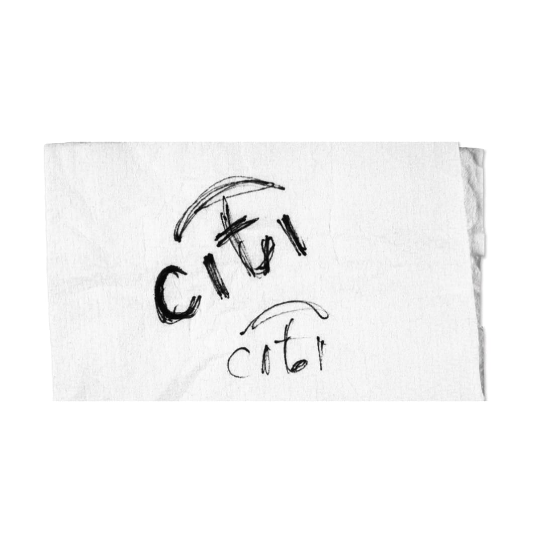
There’s that apocryphal story about Paula Scher drawing the Citi logo on a napkin in a cab on the way home from the very first client meeting — a napkin that would retroactively become worth $1.5 million. Which is, of course, the exception, not the rule. You don’t always get the logo in one go. But you do often get something in one go. If you’re fast.
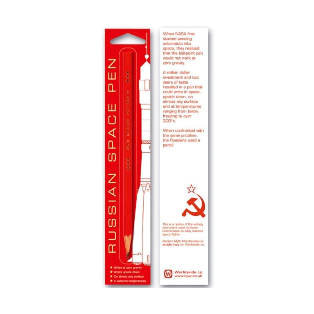
And while it turns out NASA didn’t actually spend millions on a space pen (and the Soviets didn’t just use a pencil — they had their own pens too), the myth persists for a reason. It’s comforting and true, in our opinion, to think that sometimes the oldest tools are still the right ones. Even when — especially when — they feel out of step with our slick, subscription-based reality.
Figma’s great. Canva’s fine...just. But hey those licenses add up. And a 99-cent pen doesn’t crash mid-idea.
There’s something beautifully non-volatile about paper. It doesn’t ping you. It doesn’t need charging. And when you look back at it weeks later — smudged, messy, barely legible, you normally still remember exactly how you felt and where you were when you wrote it.
So we like to take notes as close to as fast as we can think as possible.
No. 14: A MACHINE FOR LIVING
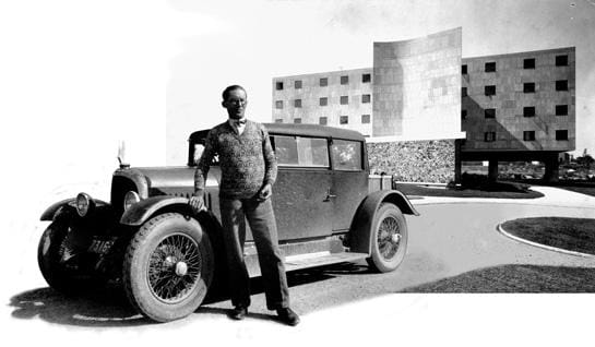
In 1924, Le Corbusier wrote in Towards an Architecture, “if houses were built industrially, mass produced like chassis, an aesthetic would be formed with surprising precision."
It’s hard to deny his point – especially during the rise of automobiles – but it seems a bit hopeful to me that he would assume this manufactured “aesthetic” would result in that of a good one.
A century later, we would describe this aesthetic as "modular housing."
Modular housing is a construction method that uses pre-fabricated sections or modules, produced in a factory setting. This approach mirrors the automotive industry, where parts are mass-produced and assembled quickly, allowing for streamlined construction processes.
Last year, the New York Times published an article on modular housing, titled How an American Dream of Housing Became a Reality in Sweden. We all know the Swedes are ahead of the game when it comes to efficiency and functionality – shoutout IKEA – however, this article really caught our attention for several reasons. [1]
First, it's fascinating that the US Department of Housing and Urban Development launched an industrialized housing initiative called “Operation Breakthrough” in 1971 and it didn't last more than two years despite being relatively successful. Operation Breakthrough built nearly 3,000 homes during that 2 year span using modular construction methods. At that time, the US had a serious housing shortage and this method of construction made total sense. So why did Operation Breakthrough stop? Politics perhaps.
Meanwhile, in Scandinavia, Francesca Mari explains how the Swedish sovereignty successfully adopted modular housing practices by funding local factories that highly resemble automobile plants. They chose to subsidize more factories, help construct all the interconnected parts of a home on an assembly line – from awnings to master bathrooms – and then rapidly assemble affordable housing using this modular kit of parts on site.
Seems logical.
Yet, why aren’t we approaching it this way in the US? "While nearly every other industry [in the US] has become more productive since 1968, productivity in home-building — the amount of work done by one worker in one hour, essentially — has declined by half," according to Mari. I think a major cause of this can be attributed to all the rules and regulations around the permitting and zoning process – an undeniably slow system. [2]
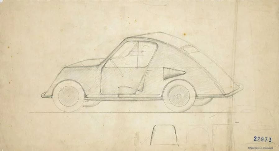
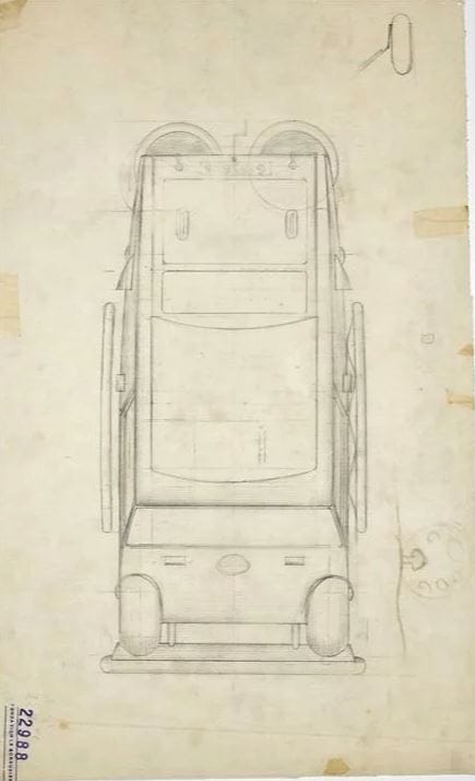
Anyway, while diving into all this modular construction-talk, I came across something quite interesting. In 1936, Le Corbusier designed “a minimalist vehicle for maximum functionality” with the help of his cousin Pierre Jeanneret. [3]
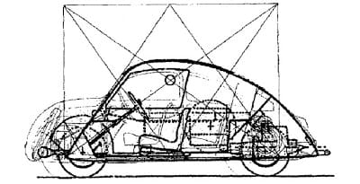
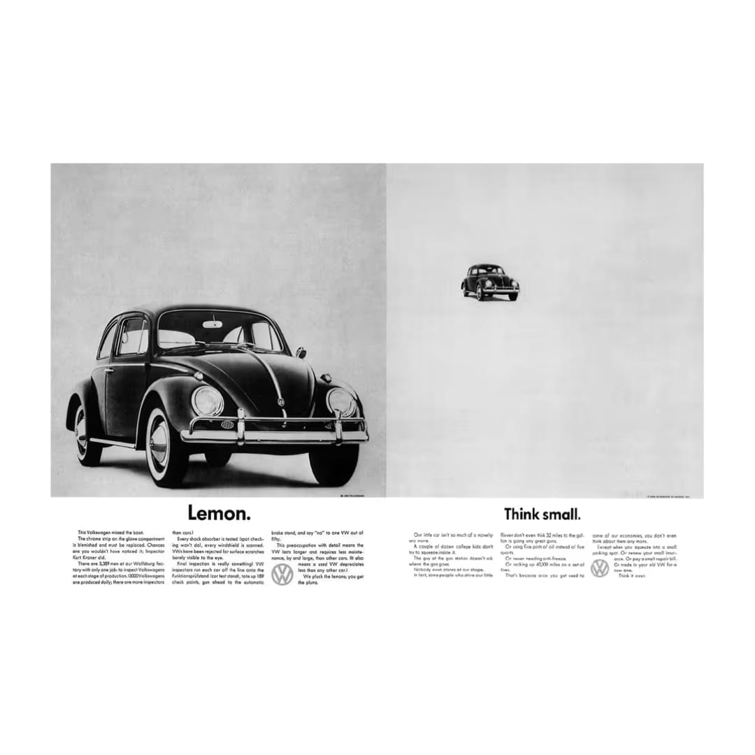
According to Corbusier this was the most functional and aero-dynamic form for a car. Two years later, in 1938, Hitler “designed” the Volkswagen Beetle – aka the people’s car.
Did one inspire the other?
A bold claim, but not entirely unfounded. Both vehicles were rooted in the idea of mass production and accessibility, designed to serve the everyday person rather than the elite. Yet, one became a global icon — despite its suspect beginnings — while the other remained a sketch in a manifesto.
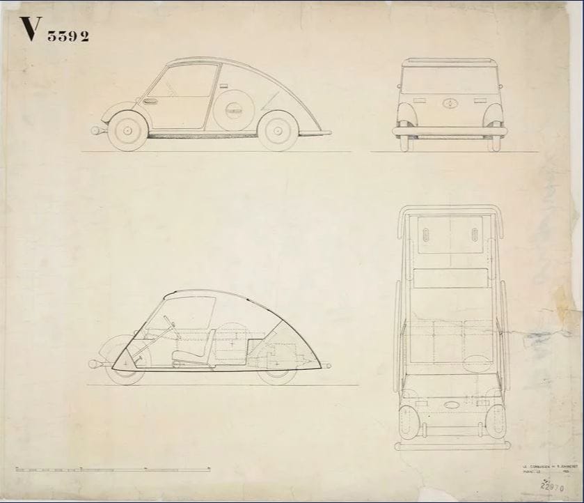
The Voiture Minimum never saw mass production — it remained a theoretical ideal rather than a functional reality. Meanwhile, the Volkswagen Beetle — though tainted by its origins — became one of the most successful cars in history. Industrial design is nothing without industry. Vision alone isn’t enough — systems, infrastructure, and political will determine whether an idea actually makes it to market.
Plus, a little bit of market-making advertising to introduce the Beetle to the US didn't hurt demand; it sold like wildfire in the free wheeling mid 60s where its compact size and affordable price were seen as an asset.
But back to housing.
Modular construction makes sense — economically, environmentally, and logistically. But like Corbusier’s car, the concept remains largely aspirational in the US. Sweden proved it works. Japan has been doing it for decades. Even post-war America flirted with it through initiatives like Operation Breakthrough, yet the U.S. housing market continues to resist innovation.
Why?
Unlike the auto industry, which thrives on efficiency (kind of) the American housing sector is tangled in red tape, outdated zoning laws, and financial incentives that favor the status quo. Developers still lean on traditional construction methods because they’re entrenched in a system that rewards inefficiency.
That's why we have an enteral housing crisis where affordability remains elusive, and sustainability is rarely a thought, normally an afterthought.
Le Corbusier may have imagined a world where homes were produced like cars, but nearly a century later, we’re still struggling to turn that vision into reality.
Until housing is treated with the same industrial rigor as automobiles, the dream of an efficient, affordable, and scalable housing solution will remain just that — a dream.
The blueprint is there — but does anyone want to build it?
No. 13: STANLEY KUBRICK: THE DESIGNER'S DIRECTOR
Here's a pretty strong argument that Stanley Kubrick was actually a designer, not a director...
A tyrannical architect of image and space.
A militant perfectionist, allergic to chance.
The man didn’t just shoot movies — he designed them, meticulously, like some sort of clairvoyant alien intelligence trying to reconstruct human reality from an incomplete dossier.
Consider 2001: A Space Odyssey: the symmetry, the stark geometry, the sterile whiteness of the Discovery One corridors. Every frame was an act of blunt force precision, every movement locked into a mechanized ballet, all — of course — shot in camera. Kubrick refused to improvise. He left absolutely nothing to the whims of some wayward, "vibes-based" actor. For Kubrick, directing wasn't just direction — it was a form of molecular level control.
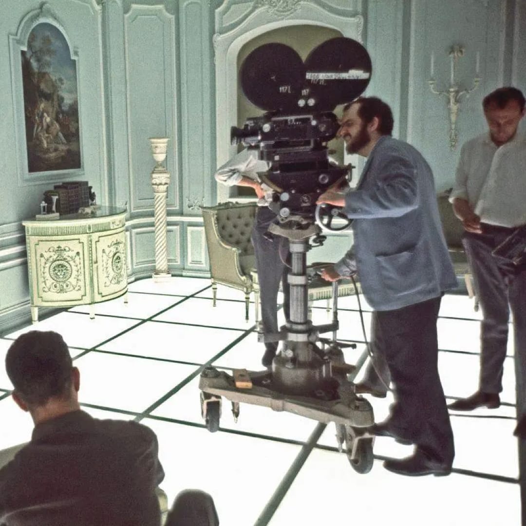
Or The Shining, a horror film where the real monster wasn't actually a person, but a place, the Overlook Hotel. Atop this craggy-fortress Kubrick created an Escherian labyrinth of impossible hallways, sickly-green bathrooms, and blood-soaked carpet patterns that felt like they were encoding some ancient symmetrical proof. The film’s horror isn’t just psychological — it’s architectural. Kubrick designed the fear.
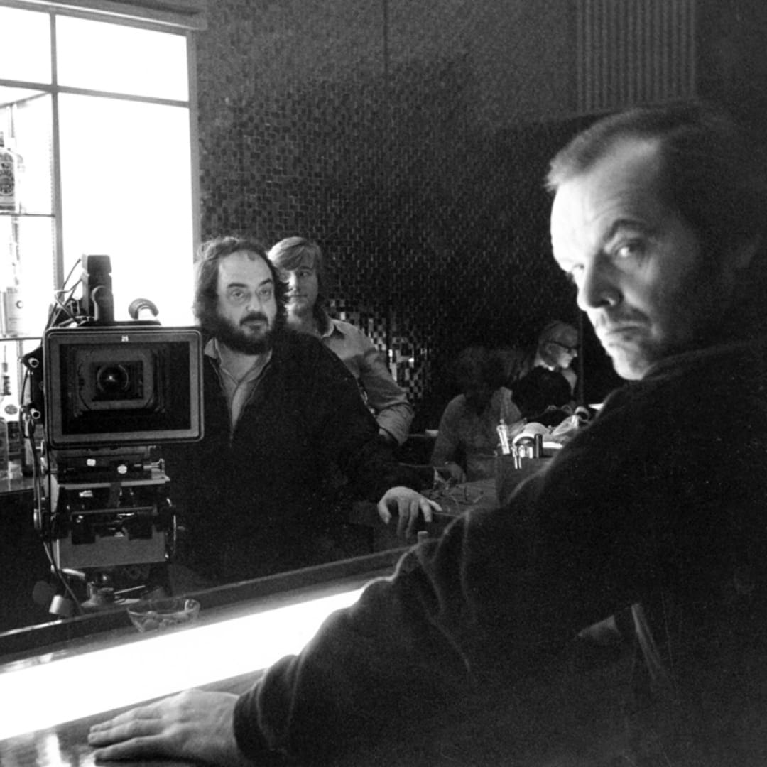
Then there’s Barry Lyndon, which isn’t so much a movie as it is an 18th-century oil painting brought violently to life. Live action Caravaggio? The costumes were sewn with such historical accuracy that the actors could barely move in them. The lighting was provided exclusively by candles because Kubrick didn’t want just historical accuracy, he wanted historical physics! Other directors “capture” light. Kubrick refracted it to his will.

And Eyes Wide Shut, his swan song — and perhaps most underrated film — was soaked in operatic decadence. The colors! The shadows! The way he designed New York City entirely on soundstages because he had a fear of flying and wasn't well enough to make it back from his countryside mansion just outside of London. And yet he somehow made New York feel more like New York than most directors who actually shoot there. Again, Kubrick didn’t document reality, he imposed it.
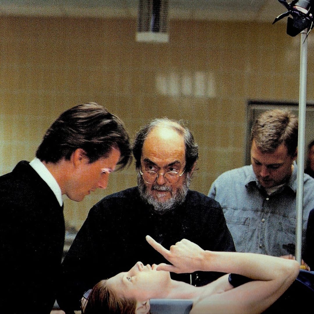
If he were coming of age in today’s world, would he merely be a director? Doubtful. The market’s too bloated, the audience too distracted, the industry too infested with jittery execs who’d demand he cut a TikTok trailer and cast a Marvel reject in the lead.
And — go forbid — anyone called him a creative director, he’d roll his eyes, blast a cig, and wordlessly walk away.
Exactly! A designer at heart!
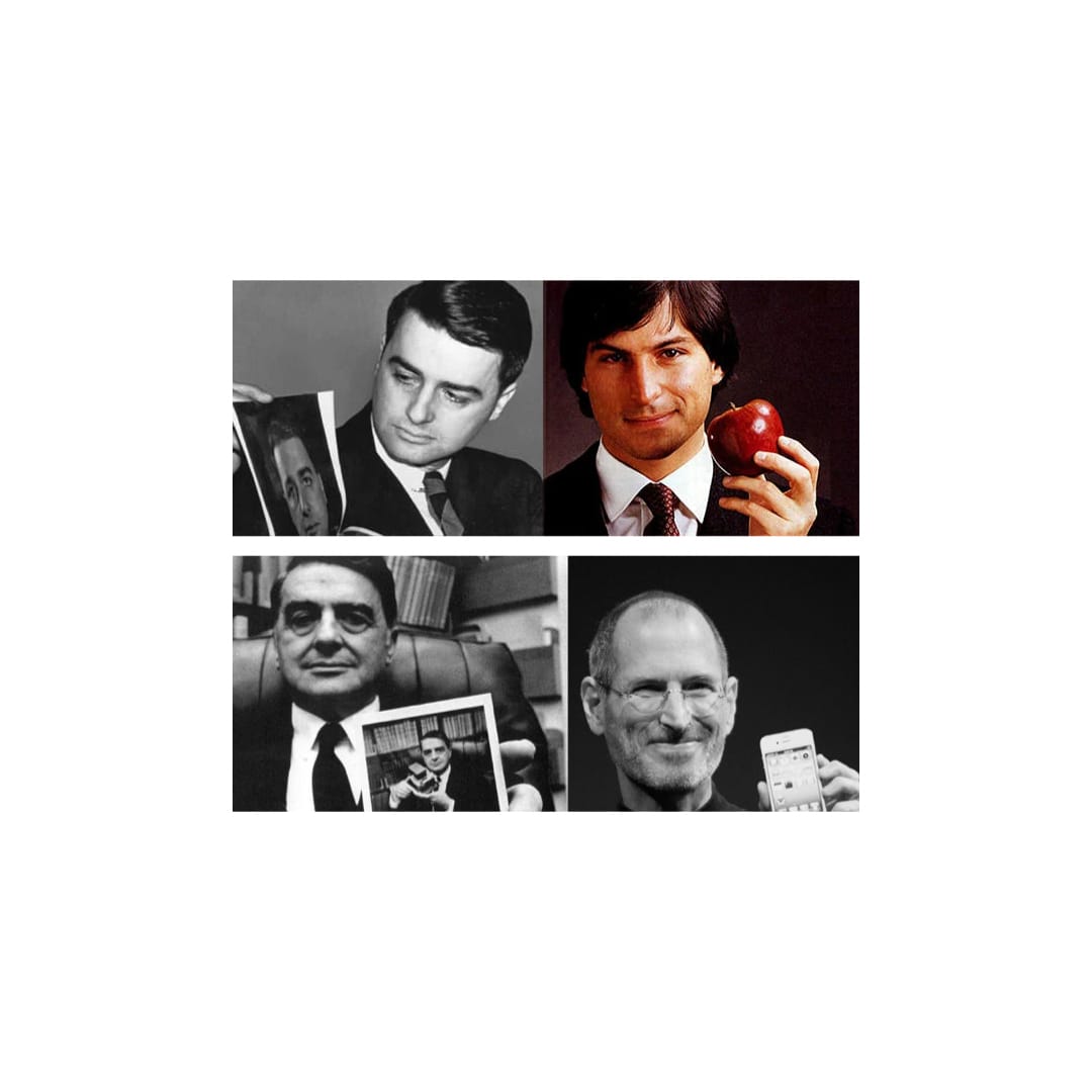
No. 12: STEVE JOBS'S GREATEST HEIST: DR EDWIN LAND & POLAROID
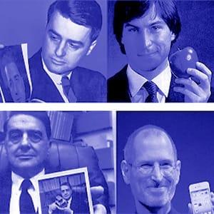
Polaroid, and it's mercurial master showman Dr Edwin Land, probably did more to inspire Steve Jobs and his products than any other person.
Jobs cited a lot of inspirations publicly — The Beatles, Bob Dylan, Eastern philosophy — but his likely intentional omission of Dr Land is perhaps most revealing.
"We have always been shameless about stealing great ideas"
So let's unpack this heist in a little more detail across three important parts of the product lifecycle — it's quite uncanny. There's one glaring difference to end on.
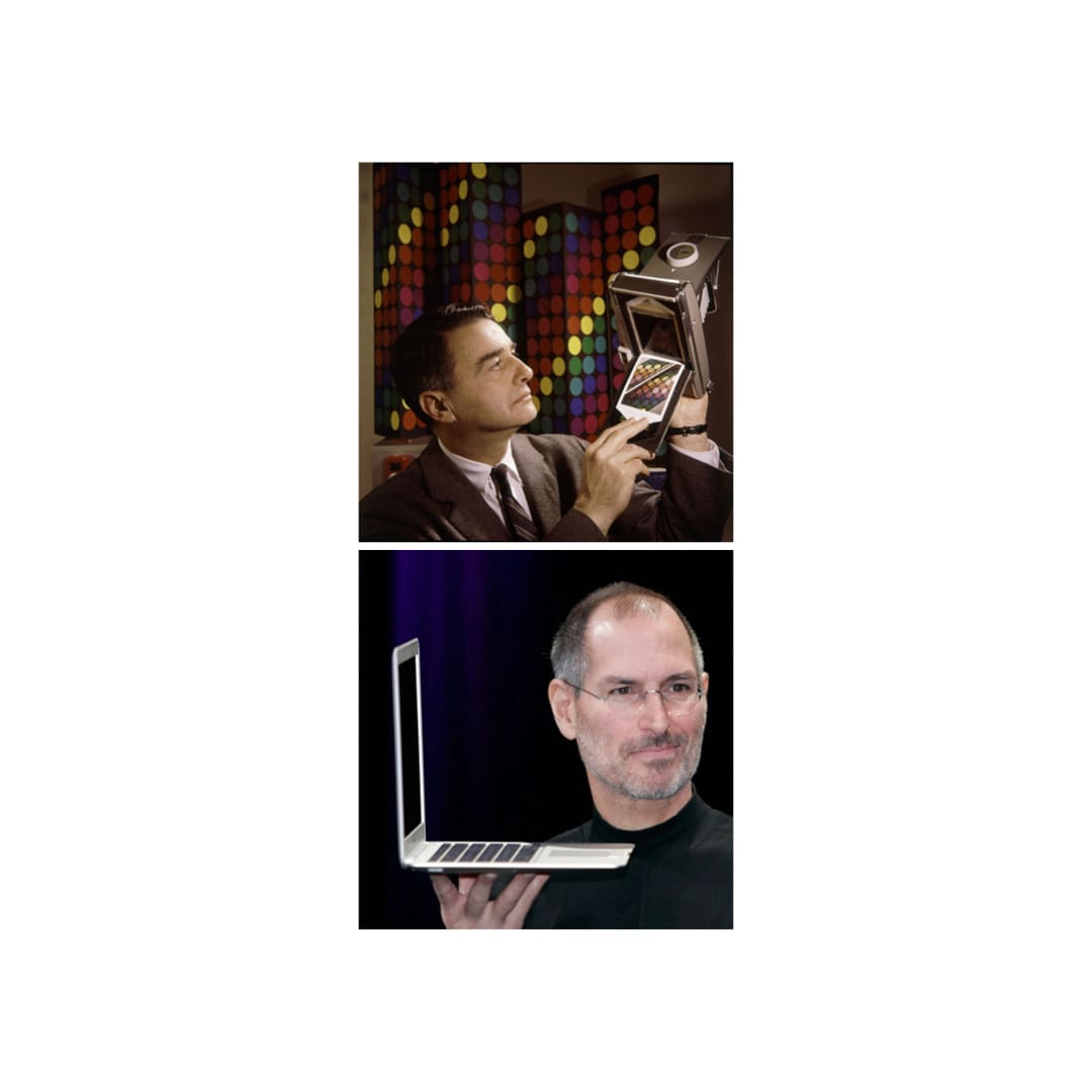
Both men favored far more development than research. Especially when it came to consumers.
Jobs famously stated that the iPhone was made without the help of any market research. Land, too, claimed that true innovation "must be startling, unexpected, and must come into a world that is not prepared for it."
For Jobs and Land, designing and developing new products was a Platonic pursuit.
Although there were undoubtedly thousands of bumps in the road, annoying product twists and turns, they viewed the process with an almost religious zeal.
Land was so obsessed with perfection, that he was willing to gamble the company on numerous occasions — just like Jobs. And when cautioned by Wall Street about how he "had little regard for the bottom line" because he spent $2B developing a camera, he simply replied "the bottom line is in heaven".
Maybe this explains the millimeter precision with which they created objects like the iPod and SX-70.
Maybe to be that good, you have to be that crazy.
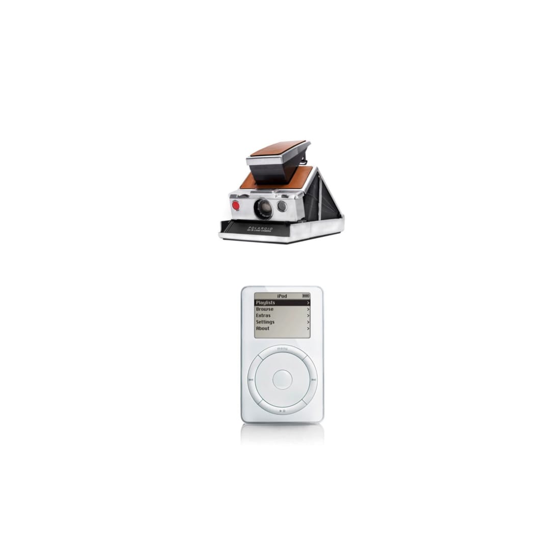
Both were systems thinkers of the first order.
They weren't just designing a single product, they saw each iteration as contribution to a corporate image and a company that was bigger than any one product. Indeed, Jobs once said that his greatest invention wasn't an Apple product — it was actually Apple Inc.
Certainly the products were beautiful, but they always embodied the brand and pointed to an experience that the end user should and could expect right out of the back. No fucking instructions!
Apple products under Jobs were all about "legendary easy of use" in a package that was so desirable you'd want to "lick" them.
Polaroid under Land was similar, but more focused on the speed and convenience of its cameras — and the technological superiority it enjoyed in the market as the world's first true "instant" camera. (This, of course, wasn't 100% true, but just like Jobs, Land understood that perception was more important than reality, and that normal people don't check citations).
Finally, and crucially, both obsessed over "end to end" control within their product ecosystems.
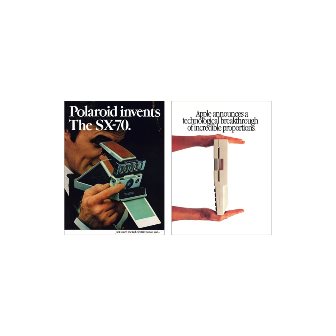
The superlatives. The insistence on "revolution" and "like never before" without ever having to say those things.
The clean, heroic product shots with clever copy that give off the impression of effortless achievement and relaxed elegance.
Both understood that you didn't have to do all too much with your advertising if you had a great product to talk about. You just needed to celebrate it, not hard sell it.
And they respected your intelligence — they didn't bash you over the head with details or speeds and feeds. The choice was simple...buy it...or don't.
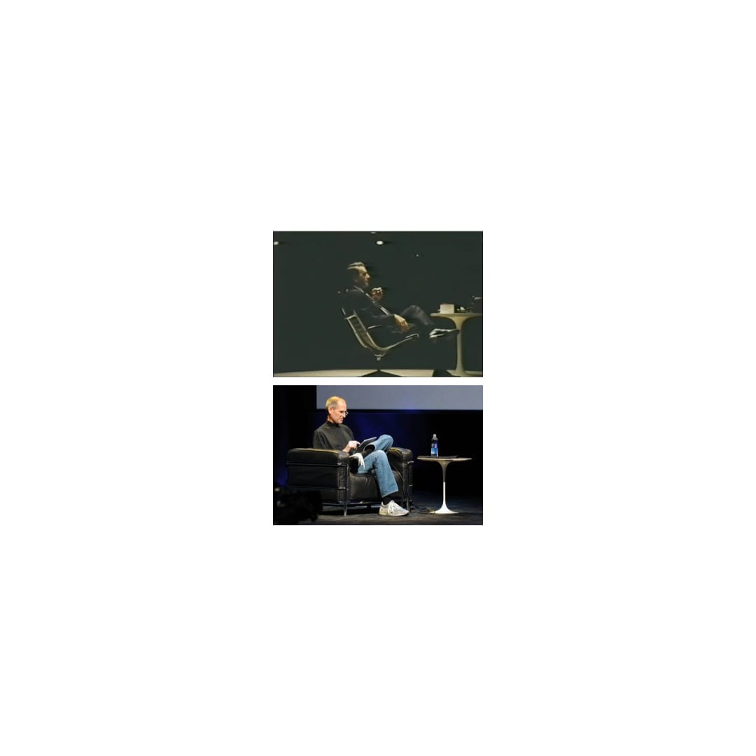
Then there was the product presentation itself — you only have one chance at a first impression.
I mean...same exact Saarinen table and stage lighting.
Jobs even held the products in the same way, to show off their most acute "tasty" angles.
THE BIG DIFFERENCE
Success is temporal.
But, in the eye's of most historians, Jobs succeeded with Apple but Land failed with Polaroid
Why?
This is a wide open debate, with many pointing to the demise of film photography that Land failed to foresee.
But we have a hot take. It can probably be boiled down to the fact that Land was technical and Jobs was not — the former a doctor, the latter a dropout.
You see, for all his arrogance and ass-holicness, Job always had to be a team player — he simply could not build these things on his own, because he really had no technical know-how.
But Land, for the most part, could. Hence the whole "Doctor" prefix. So he set about gearing the organization around him, tooling it so that he alone called the shots. As time went on, and the fundamental market dynamics of his fundamentally "analog" business collapsed around him, he was too deeply involved in the details to see around the next corner — that preternatural Jobs trait which has built the greatest consumer company the world has ever known.
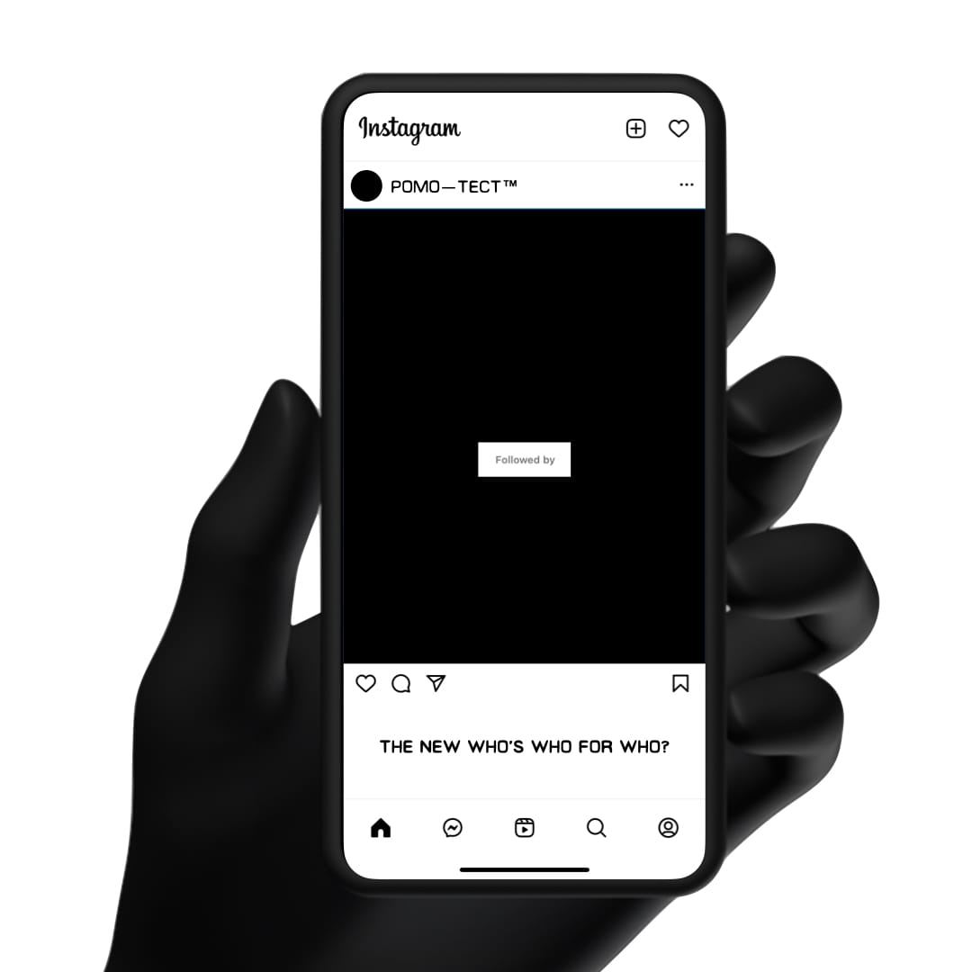
No. 11: FOLLOWED BY: THE NEW WHO'S WHO FOR WHO?
There's an overlooked shadow social media network that no one is talking about.
And it's creating new forms of clout and anxiety for the chronically online.
It all starts with the humble "follow" button.
We’ve all touched one.
They’re rendered in kindergarten colors, most white text on blue background.
In fact, this near-universal agreement on color palette may be the only common ground left for conformity in our Techno King commanded 16:9 chamfered rectangles.
Just before that fateful multitouch press whirlpools you into a new stream of content to en-shittify your feed, you must confront the hallowed “Followed By” feature.
The idea is pretty simple — social platforms automatically show you who else from your followers list also follows that same account. And you’re more likely to follow that account if lots of people you know also do. It’s kind of like those things that we used to call mutual friends, but much less annoying.
And yet, this simple concept sets off an array of questions — from the pointless to the profound — that all of us, or at least we — answer mostly subliminally.
Sometimes literally.
If 25+ of my friends already follow @InterGalacticDankMemes420 am I a mere sheep?
Or am I perhaps missing out on rib-tickling, life-altering cultural commentary?
Do I want to be associated with that person, however tenuously, from middle school or college or work who I never really liked but now follow on this platform?
And what if it transpires that we both follow an unsavory account, @PonziSchemeBestPractices?
Or am I going to be revealed as a fraud if my friends find out that I’ve been mining a niche account with very few followers in order to manufacture an important part of my personality? Like, say, my whole worldview?
There’s judgment galore, too.
@LaVieEnParis? Give me a break @JimmyMakesLayups you’re a Caucasian male from the suburbs of Bethesda.
@SambasAndCigs follows @CBGB? It closed in 2006. You were maybe ten.
Finally, there’s the elusive virgin ground "Not followed by anyone you know”.
This is the Rubicon, the Xanadu of clout — potentially.
On the one hand, perhaps you just found something or someone so out there, so damn original, that not even the most plugged-in, downtown-out mutual follower could reach…
A print-only German language Drum & Bass appreciation account?
A Lower East Side creative consultancy that activates brands with nothing but their minds?
On the other hand, maybe you just accidentally tapped on a FreshDirect in-feed display ad while sitting on the ivory throne.
In any case, for the more entrepreneurially inclined, Followed By is the next great platform waiting in the wings.
For the rest of us, it’s another brief, fleeting moment in which we can make ourselves feel better about our own taste, or confirm the lack thereof among our fellow intrepid digital voyagers.
Don't forget to follow us!
No. 10: PITCHED DOWN: THE ART AND AROUSAL OF DOWN TEMPO JAMS
Is a dance floor a dance floor when no one's dancing?
That's irrelevant to most late-night revelers because they've never seen such a sight.
But for the Opening DJ, it can be a nightly occurrence.
For some, it's a nightmare. You get up there. Plug in. Fumble around with the EQs trying to familiarize yourself with a foreign set up before getting something cued in the headphones before starting to timidly play out over the system.
Many suffer from the pre-beer-number-two-jitters at this point — your hands are still a little bit sweaty and every transition feels like jamming a pick axe into a recalcitrant ice sheet.
Yet for all its terror, all its blank canvas of infinite possibility staring you down, the opening few songs of the night are where many among us find solace — a golden opportunity to play some of the slower and some of the weirder stuff.
It's in this liminal zone, when things are just filling up, that the genre-agnostic experimentation can truly happen.
Could you mix Dizzy Gillespie into Can?
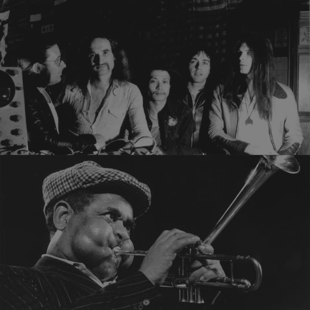
How about just letting Marvin Gaye's "I Want You" play out in its entirety on one side?
This is to say nothing of the ongoing contemporary mini-renaissance in slower house/disco jams from the likes of Fernando, 6th Borough Project (great fucking name!), or Mermaid Chunky. And Benji B has a knack for turning a down tempo intro into an entire show, detonating the concept of genres in the process.
There's something about this slower speed that offers a wealth of space — the music feels like it has more time to breathe. There's more room for instrumentation. A synth chord can wobble and sublimate into something else in a little more peace. And there's also more space on the floor itself — it's less taboo to hold a polite conversation with a friend, or comment on a sound you liked. Or subtlety pocket Shazam a track that you'll steal for posterity.
Sadly, contemporary club culture is all about the headliner. The openers are second class citizens, there literally to fill space and time.
Our advice? Go to the show early. Honor the opening-DJ. Aspire to become the opening-DJ.

Because when it's done right, they can keep people about for the whole night.
There's nothing more satisfying than stealing potential listeners from the main event, or hearing those magic few words as you step out of the booth: "you're a hard act to follow".
No.9: CONSPICUOUS CURATION: THE PANOPTICON OF TASTE
Why does everything we know and love have to be shared with the world?
One theory of ours is that contemporary digital life has created a sort of "panopticon of taste", in which we are all fairly willing captives.
At every turn — in a 360 degrees circle, to be true to the metaphor — we're encouraged to constantly share the newest find while others watch and judge, typically from great virtual distance.
We have a view into all of the activities and interests of all of those we "follow", and if internet protocol is correctly adhered to, they also see us.
If the second half of the twentieth century was the era of "conspicuous consumption", we have surely entered a new era, one of "conspicuous curation".
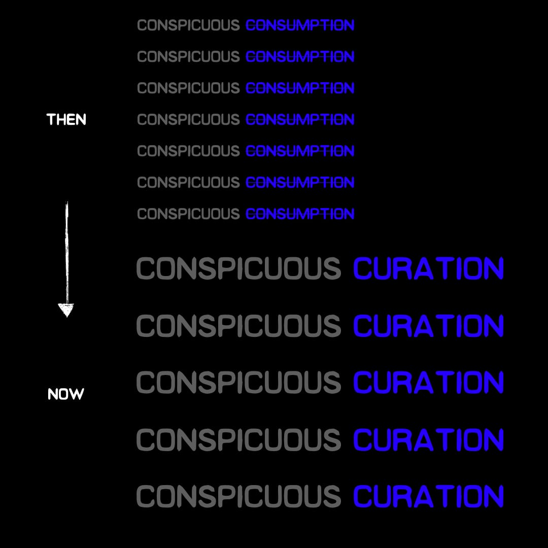
Today, it's less about what you own and more about who you follow, where you go, and what you know.
There are two main reasons for this.
First, Instagram. In many ways IG is the new business card. It's often then first point of contact with someone on a night or day out. But that's just beginning. From there, it's a constant battle to retain the interest
Second, iPhone cameras. Everywhere. Now, it almost feels harder not take a picture of something that you feel the need to curate for your followers.
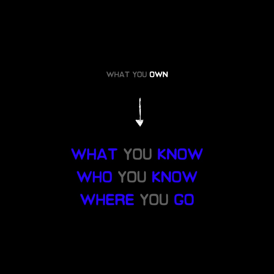
The most insidious thing about the development of Conspicuous Curation versus Conspicuous Consumption is that it used to be tough to buy taste. Now it's available more and more for free — provided you know the right places to look and who to follow.
To be clear, Postmodern Tectonics is fully engaged in this digital racket, to a degree. It's requisite for any company. Especially one involved in the business of taste. And we thank you for your follow-ship!
But it's our hope that, through what we design and bring into the world and how we even do that, that we're able to minimize the performative nature of modern life and maximize the substance.
That's why our approach to making is an attempt to honor, and perhaps mirror the the earlier days of the internet, where there were at least some barriers to entry...
Curiosity. A little bit of ability. And the drive to make stuff because you wanted to, not because you needed to.
So it's wrong that "Gatekeeping" has become a byword for creative small mindedness, even spitefulness.
But what is to become of a world where good taste is available to all?
How will we discern the trend makers from the trend fakers?
No. 8: RUGS ON WALLS… IT'S A THING AGAIN
This weekend I visited Huntington Library with my parents and it reminded me: back in the day, people would mount intricate rugs (or tapestries) on their dining room walls. But why?
“Warmth,” according to my mom. Perhaps, maybe… before they had HVAC systems.
First of all, never doubt your mom because she’s always right. Second, what really happened to the intricate rugs and why are they still on the floor?
Recently, I noticed that there has been a resurgence of antiquity items found within contemporary architecture, or the interior design of architectural spaces. Maybe it’s just a continuation of the vintage obsession that we all know so well; nevertheless, people are starting to reintroduce tapestries to the wall and I think I’m a fan of it.
Yes, it may provide a little bit of warmth and it may also look stylish, but why does any of this fascinate me?
Well, it doesn’t so much from an interior design perspective, but as an architect, it feels… somewhat permanent again. And that’s refreshing I guess. In the image above they solved an awkward column in the middle of the bedroom by placing an antique tapestry on the wall – an aesthetic similar to something you might find in a Palladian villa. To me, that tapestry above is an architectural tool, not an interior decoration. And that detail-oriented decision is hard to come by nowadays.
I like when an architectural expression is conceived from an interior aesthetic; before there was even an interior to begin with. Sure it’s always fashionable to employ vintage accessories within modern spaces, especially within interior design, but now it has become uniquely architectural again.
How so?
We all like to reference those popular modernists from the early 20th century – the ones that would argue over form versus function and living in a machine. Regardless of their reputation, I admire this group because they focused their intentions on the details that filled their spaces – the materials, the furniture, the feel and all that. Some of their spaces may have felt empty while others ornate, but everything was undoubtedly deliberate and they designed everything down to the very last detail. Here are some snapshots I took from Villa La Roche and Villa Savoye in 2018.
[Le Corbusier, Villa La Roche, 1925. Photo taken 2018]
From a brass doorknob to a circular light-switch or a bathtub customized to the shape of your back, we don’t really come across those details anymore… at least not very often.
Some of these decisions may provide style while the others provide utility, but all were deliberately placed there before the building was conceptualized. Sadly, to me, it seems that details have become somewhat of an afterthought in 2024. You might point to several arguments against that statement, but as a collective – especially among those fashionable ‘starchitects’ – that is the truth.
How come?
In my opinion, this lack of care is because the detailing of an interior is often left to someone else nowadays – the client, a consultant, or even the contractor. But where’s the architect in all this?
[Le Corbusier, Villa Savoye, 1931. Photo taken 2018]
It seems that what was once a bountiful relationship between interior and exterior has evolved into two entirely different professions — two star-crossed lovers if you will. So, why are architects increasingly estranged from the detailing of their own spaces?
Perhaps there just isn't time to get bogged down in all that anymore. Architects are constantly overworked and clientele just want a pretty image to market to the world. We live in an era of mass globalization that has fostered new priorities in the client, and as a result, the architect has lost sight of the ultimate goal – the warmth. Yes, buildings were once smaller and audiences much closer, but now everything is accessible online and designers are more preoccupied with how their spaces look in a digital format.
Space is defined by shadow and light, yes, but neither of those things provide warmth – the objects that fill the space do. The team over at Food Architects strike the perfect balance between shadow, light and object in their most recent design for an avante-garde loft in SoHo, New York. Their sense of playfulness and attention to detail resonates with us at Postmodern Tectonics, and for that, we applaud them. They even put a rug on a wall. Go check it out.

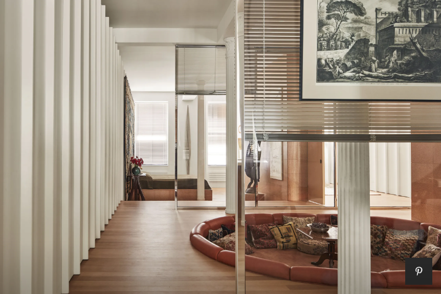
[1] We like to call that the money shot.
No. 7: JAZZY SUITS: THE PRISTINE TAILORING OF A CHAOTIC SOUND
Fashion and music go hand in hand.
It's a constant dialogue, but it used to be a much louder conversation.
Post-Beatles — because all music history is really just pre and post John, Paul, Ringo, and George — identity and sound co-mingled.
Punks had the hair.
Mods had the bikes.
Hippies had the smell.
Prior to probably the turn of this century, you tended to wear what you listened in in more of a correlated way.
Music doesn't have that sense of identity anymore.
Jazz is almost always on the POMO—TECT ™ office turntable. Typically on the funkier side.
What was so cool about that era was that the music they made didn't dictate a sartorial style.
It was completely revolutionary. Yet their appearances were sharp. Suited. And booted.
They followed rules in what they wore.
They broke rules in what they made.

Just look at Miles Davis and Dizzy Gillespie and all jazz greats who saw dressing up in perfect tailoring as part of the job — not because they wanted to stand out. But because they perhaps knew the sounds would speak for themselves.

Jazz is a unique form of music because you're never quite sure if it's good.
It has to hit you viscerally.
It can't explain itself.
And you can't explain it.
It works if you feel something.
Because it was always supposed to make you move.
Just try not to fuck up your shoes too much.

No. 6 - TECTONICS, TECTONICUS, TEKTON
What are tectonics and why are we interested in them? Many associate the word with the geological plates that shift under our feet. While those are inherently important, we’re not quite interested in tectonic shifts pertaining to the earth’s crust… at least not yet. Rather, we’re interested in the word’s original etymology:
tectonic (adj.) 1650, “of or relating to building or construction,” which can be derived from the ancient Greek term tekton “builder, carpenter, woodworker; master in any art (sculpture, metal-work, writing).” [1]
One can even take its etymology back to the Proto-Indo-European root teks- meaning “to weave,” also “to fabricate,” especially with an ax.
It is to our utmost disgrace that we have not yet mastered the art of fabricating with an ax, but it might in fact be a new goal of ours. For the time being, we would like to start simple, with garments... before someone hurts themselves.
In 1986, Robert Maulden wrote, "Tectonics in architecture is defined as the science or art of construction, both in relation to use and artistic design. It refers not just to the 'activity of making the materially requisite; construction that answers certain needs, but rather to the activity that raises this construction to an art form.'" [2]
This particular definition has always resonated with us, for our ultimate goal at Postmodern Tectonics is to consolidate a wide variety of artistic trades and equip those who have similar interests with the gear necessary to take on their various tasks. We all like to DJ, we like to sculpt, and we like to write. We also know that we’re certainly not the best at any of these things but we sure god damn love doing them and would love to fabricate objects that help others do so too.
This is a goal of ours – to explore various tectonics, talk about them, and hopefully share our research with the world.
Enjoy.
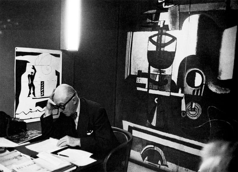
No. 5: LOGOMOTIVE
Let me write a little about our logo.
Our main priority in establishing postmodern tectonics was manifesting an all-encompassing exchange of ideas – or as we like to say, a b2b of ideas. Disciplined observation of the world is the source of all creative inspiration, so we try to keep an eye or ear out for goings-on worth going on about. This love for observation and conversation stemmed from sending each other random shit off Instagram and has now somehow evolved into a website. The logo we landed on stemmed from this exact back-and-forth of ideas:
Pete wanted a symbol. I don’t really like symbols – or iconography that is. But we’ve always been curious about tag signs and signatures. It’s interesting to me that everyone has a different signature. It was also interesting that Basquiat got his name around New York by simply tagging “SAMO” on various walls. Word really gets around. Artists often sign their artwork; why don’t architects? Well, I guess some do, but maybe that's just conceited. Or, perhaps most architecture isn’t really worth signing in the first place. Diego Rivera would sign his buildings occasionally. I guess Le Corbusier also tagged some of his projects with that cubist hand emblem. That’s like a graffiti tag of sorts. What did that hand mean again?
The Open Hand motif was a symbol Le Corbusier employed for the design of a monument in Chandigarh, India.
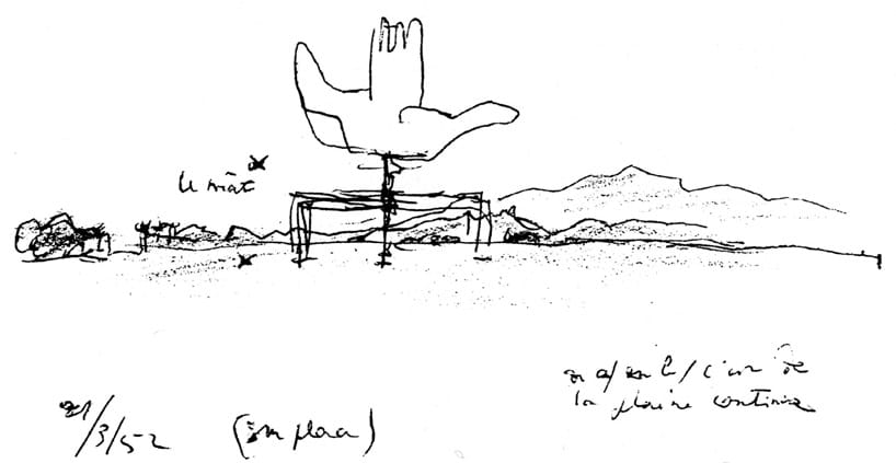
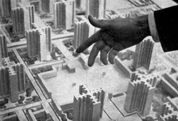
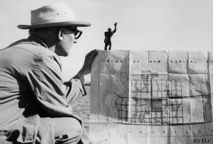
If you’re not familiar with Chandigarh, or not familiar with Le Corbusier, it’s worth a read. In the 1960s, the Swiss-French architect Le Corbusier was hired to design the masterplan for the capitol complex of Chandigarh, India – the capital city of the northern Indian states of Punjab and Haryana. This masterplan included the design of a monument in which Le Corbusier first displayed the Open Hand emblem. This Monument may not have been the architect’s first time referencing the open hand, at least according to Jane Drew and Russell Walden. Nevertheless, it was the first time publicized in the world and eventually became part of his lifetime philosophy – “the hand to give and the hand to take,” or an openness to collaboration. Everyone must learn from and give back to the world; that was his ultimate goal.
Written a month before he died, Le Corbusier affirmed the Hand “was open to receive the wealth that the world has created, to distribute it to the people of the world and therefore it ought to be the symbol of our age” (The Open Hand, Russell Walden).
This ideology of course resonates with us and led us down a rabbit hole of internal studies. Can we abstract this cubist concept into one swoop of a pen? Remember those blind contour exercises in art class where you try to draw an object – like your hand – without looking at the pen and without lifting the pen from your page?
Let’s create a logo like that – something that conveys meaning but can be expressed with one swoop of a pen.
Pete: “plus it’s dope that you can make a gang sign out of it!”






No. 4: DESPACIO: WHERE MUSIC + SPATIAL DESIGN COLLIDE
If you haven’t read the Wired article on Despacio, we highly recommend you do so. Honestly, perhaps just close this blog post and go read that.
Or don’t.
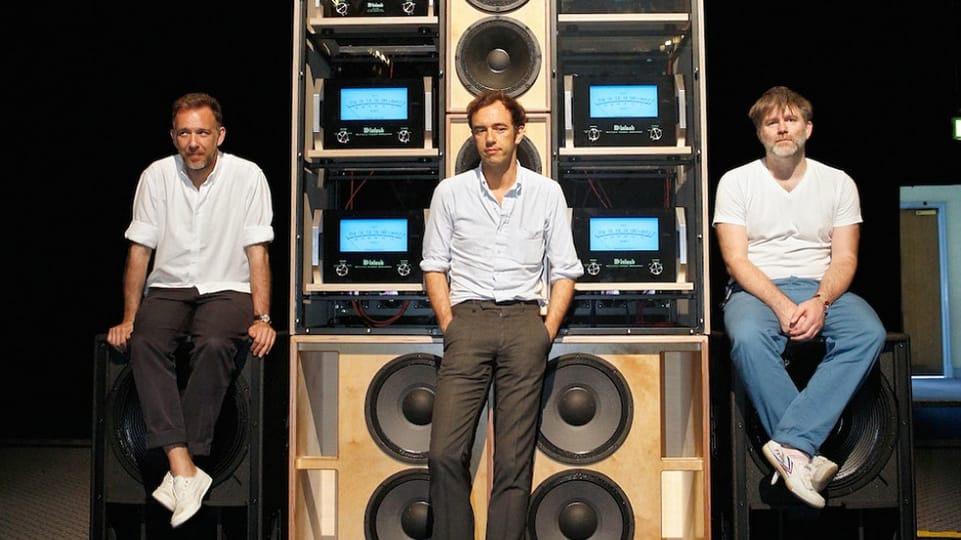
In 2013, a group of punk rock audiophiles built the world’s greatest club soundsystem and 10-years later, they’re touring it around the world.
James Murphy, John Klett and the Dewaele brothers are the geniuses we all needed. Their communal love for the analogue is everything we admire at postmodern tectonics, and the four of them manifested this love into one singular moment on the Despacio dancefloor!
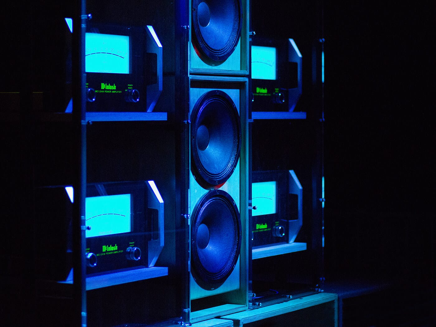
Everyone has heard of Grateful Dead’s ‘Wall of Sound,’ but many are still new to Despacio’s checkerboard dancefloor. Both systems utilize McIntosh’s industry respected amplifiers; however, the Wall of Sound only tackled 30,000 watts of power, while Despacio took on 50,000 watts. Perhaps this means nothing to you, but we’re not so much interested in the sound stats either. We’re interested in the aesthetics.
At postmodern tectonics, we share a love for analogue design, and audio equipment is a prime example of the analogue. From Technics turntables to McIntosh amplifiers, why change what isn't broken? Not only do these devices sound good, they look good too and they're durable! The punk rock trio shares this feeling and exemplifies it in their spatial design. We love them for it.
As David Dewaele puts so well,
"The system couldn't just sound good, it had to look good too.
Dewaele points out that something he, his brother and Murphy share is a love for old instruments and records, all highly driven by aesthetics. "If a great piece of machinery looks ugly it will never be in a studio," he says.
Dewaele talks fondly about the blue light that comes from the McIntosh amps. "The blue light emanating from all the stacks is a really beautiful thing, even when all the lights are turned off.
The amps are a design classic, like an Eames chair or something."
When designing a sound space, its not always just about the acoustics – its about the experience.
If you ever make it to a Despacio party, take a look around – the entire experience is aesthetically designed. From the very floor you stand on to the music you're listening to, you'll love them for it too.
No. 3: THE ARCHITECTURAL COLLAGE
The architectural collage was once an extremely valuable tool... and it's making a resurgence.
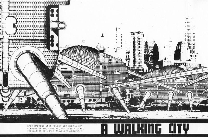
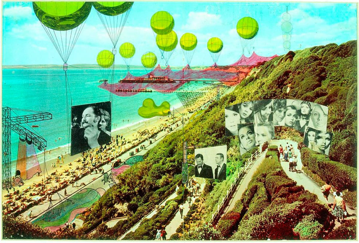
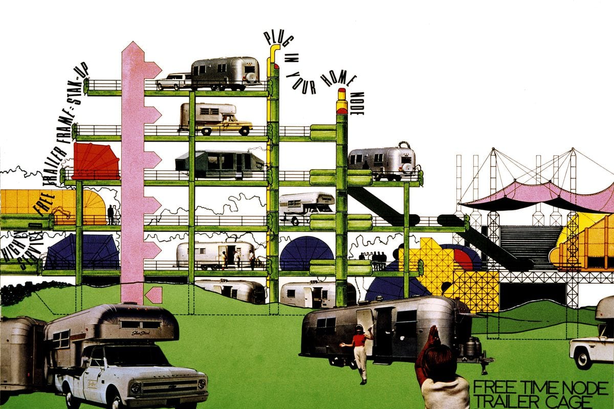
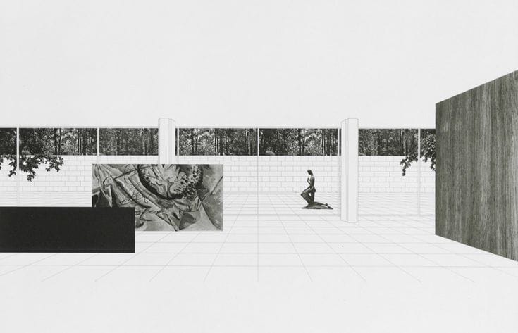
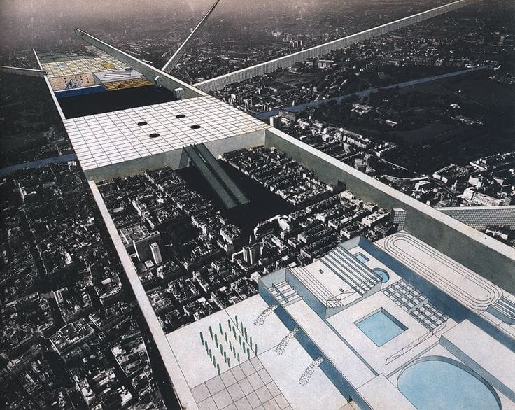
The Archigram collective was a rad group of thinkers who took the collage to the next level during the 1960's. In a partial protest against the simplicity of modernism – at the height of modernism – the group took an extremist approach to urban proposals and publicized them via the collage.
Many of these "visions" seemed intentionally impossible – almost reminiscing aspects of a Studio Ghibli world with city's that could walk or a continuous monument stretching through the desert. Now, some of those proposals actually do exist – shoutout NEOM – and it was partially made possible through Archigram's futuristic imagery.
Nowadays, we're seeing that same outlandish aesthetic reintroduced into the design world. Often in school projects or sometimes in an OMA diagram, it feels somewhat familiar and its abstraction often speeds things up for us as designers. There's nothing like getting a point across by spending five-minutes in photoshop, cut n' pasting a few images and saying it’s a stylized render – thanks Archigram.
Anyway, they knew what they were doing and not just in their love for ambiguity. At heart, Archigram was a collective and they loved to collaborate. They didn't build much but they worked with many, published an enormous amount of thought, and influenced some of the best – including the likes of Super Studio, Mies, Zaha, Koolhaas, and the list goes on.
And, I guess that's what it’s all about. If you have an interesting thought and don’t know what to do with it: get it out of your head, off your laptop and into the world. Make a damn collage.
No. 2: THE HYPNOTIC ALBUM ART ICONOGRAPHY OF HIPGNOSIS
It’s funny — maybe sad? — that in our time, it feels like such little importance is given to album art.
It’s there, sure, but it’s less central.
Wolfgang Tillmans for Frank Ocean is one of the few in recent memory that has become iconic. But in the streaming first world, ironically, it’s the music that matters.
Hipgnosis was a duo of true merry pranksters, with little formal training in the graphic arts, who produced some of the most provocative and show-stopping covers of the 60s and 70s.
Dark Side of the Moon, come on!
They paid incredible attention to detail and analog practices. Literally creating the image in real life, and in-camera for the most part.
Which is just incredible to conceive in the days before digital layers and vectors
“Squaring the Circle” is on Netflix now and tells the full, heady story.
No. 1: THE DIY, MISANTHROPIC, TOTALLY INTENTIONAL IDGAF DFA AESTHETIC
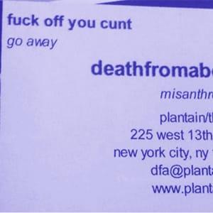
You’re probably not in client services if the strapline on your business card reads “fuck off you cunt. go away.”
But that was the raison d’etre for the early DFA ethos — “misanthropists” as they put it — a bootstrapped production duo of James Murphy and Tim Goldsworthy who were living and working out of a basement in the West Village, taping pillows to drum kits to generate their characteristic thud-not-clap live-drum sound.
Nominally, they really did not give a fuck what you thought.
But they of course did when it came to the product, the sounds.
The visual accouterments — the five-dollar disco ball crudely Xerox’d directly from the package, the lightening bolt logo that seems stolen from the refuse drawer in a vintage printing press — served only to enhance the “we’re not like the other guys” mentality that set DFA apart.
It’s stupidity-by-design, but it hid (and still hides) the incredible complexity and thought that goes into their unique fusion of dance and punk that moves bodies en masse.
Ultimately it works because it feels like you could do it with your friends in thirty minutes with a six-pack.
More things should feel like that.

