No. 5: LOGOMOTIVE
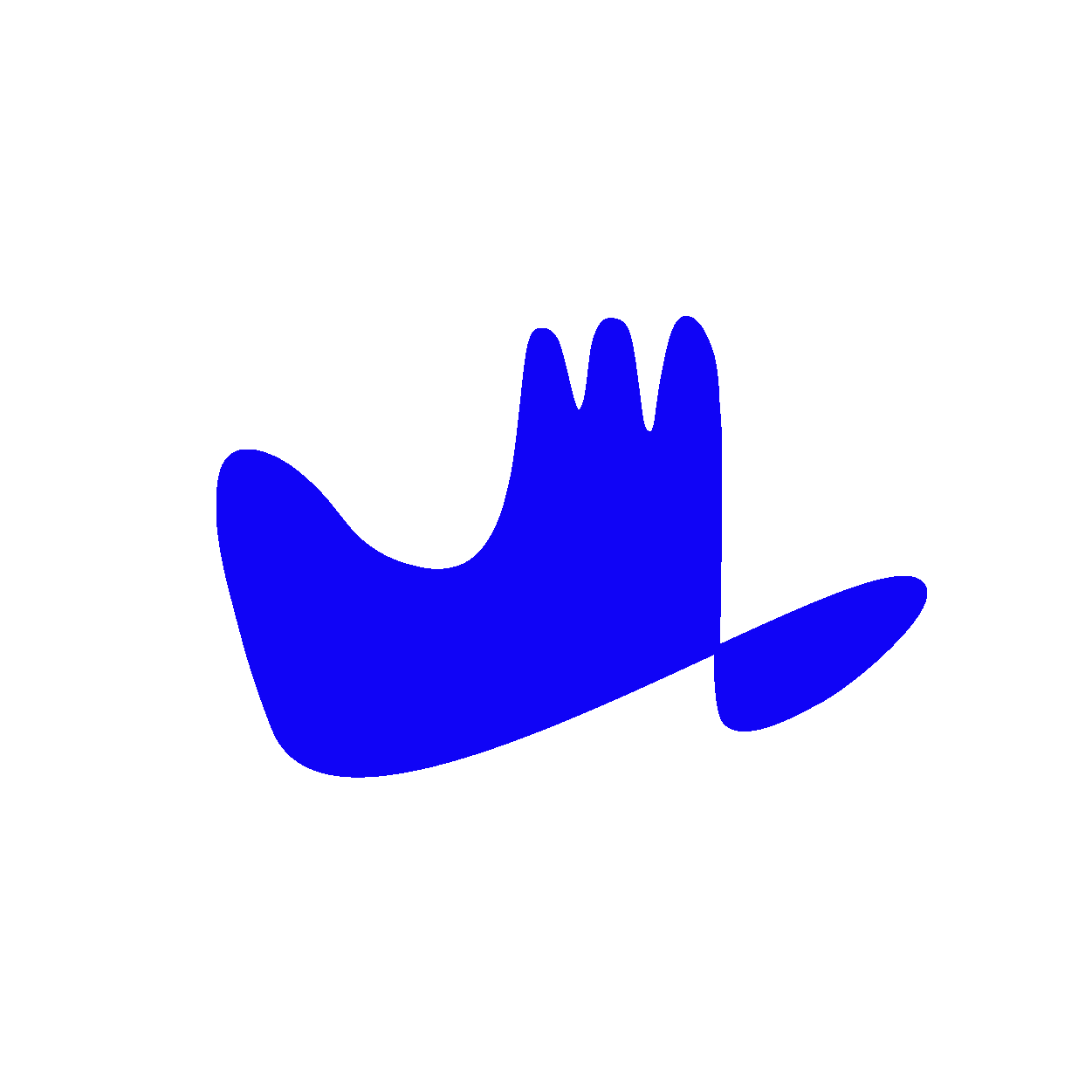
Let me write a little about our logo.
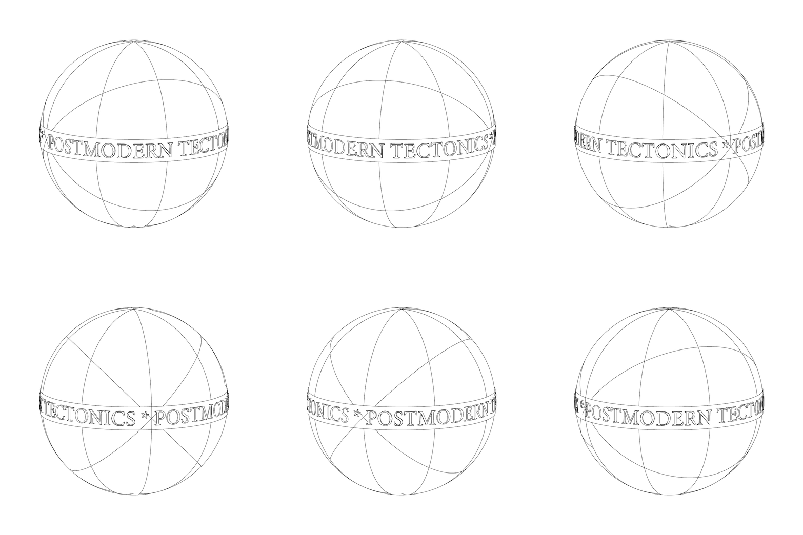
Our main priority in establishing postmodern tectonics was manifesting an all-encompassing exchange of ideas – or as we like to say, a b2b of ideas. Disciplined observation of the world is the source of all creative inspiration, so we try to keep an eye or ear out for goings-on worth going on about. This love for observation and conversation stemmed from sending each other random shit off Instagram and has now somehow evolved into a website. The logo we landed on stemmed from this exact back-and-forth of ideas:
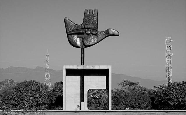
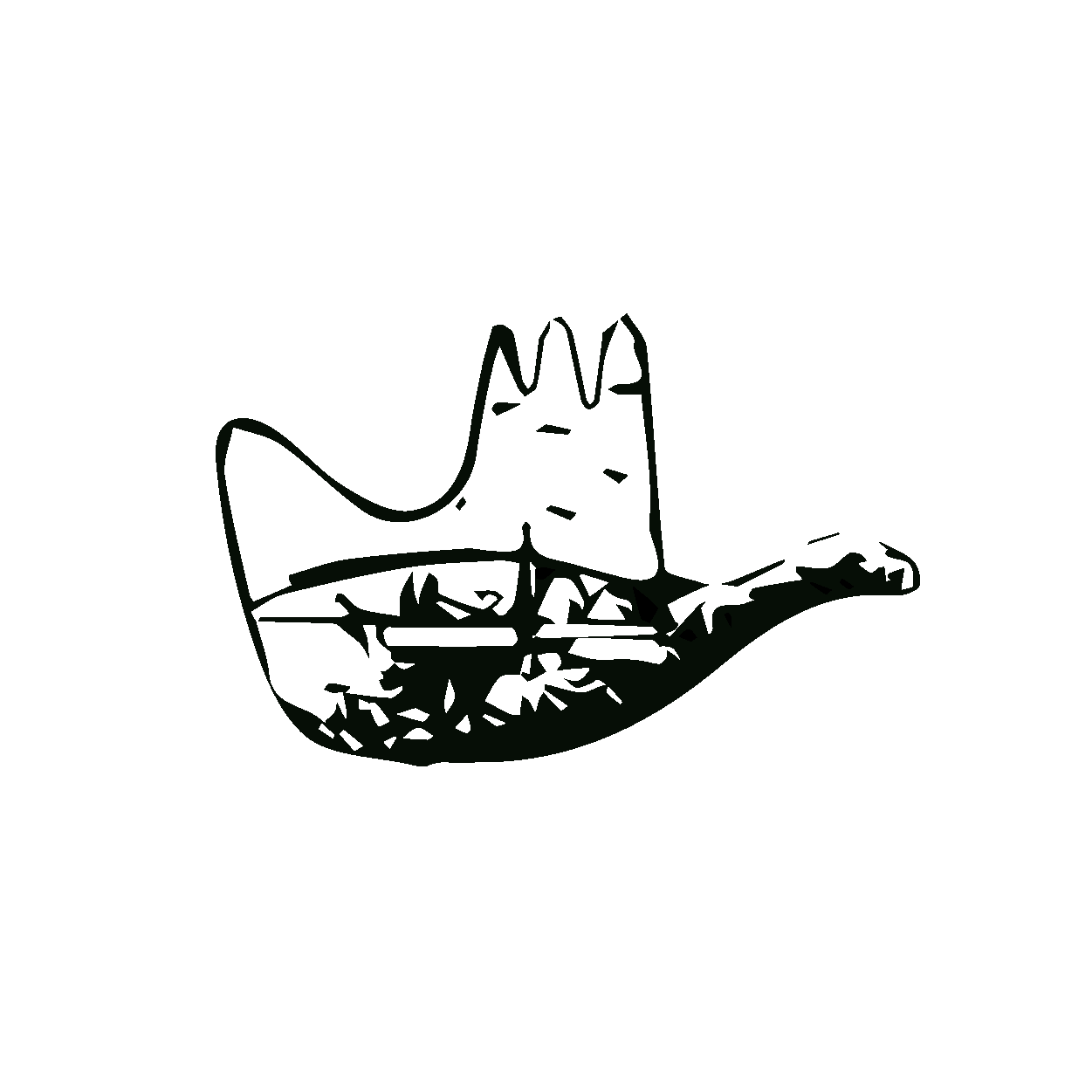
Pete wanted a symbol. I don’t really like symbols – or iconography that is. But we’ve always been curious about tag signs and signatures. It’s interesting to me that everyone has a different signature. It was also interesting that Basquiat got his name around New York by simply tagging “SAMO” on various walls. Word really gets around. Artists often sign their artwork; why don’t architects? Well, I guess some do, but maybe that's just conceited. Or, perhaps most architecture isn’t really worth signing in the first place. Diego Rivera would sign his buildings occasionally. I guess Le Corbusier also tagged some of his projects with that cubist hand emblem. That’s like a graffiti tag of sorts. What did that hand mean again?
The Open Hand motif was a symbol Le Corbusier employed for the design of a monument in Chandigarh, India.
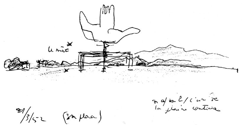
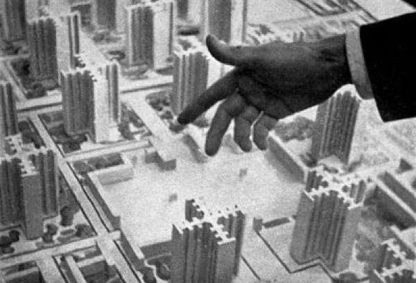
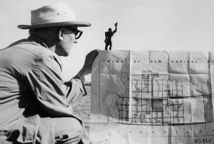
If you’re not familiar with Chandigarh, or not familiar with Le Corbusier, it’s worth a read. In the 1960s, the Swiss-French architect Le Corbusier was hired to design the masterplan for the capitol complex of Chandigarh, India – the capital city of the northern Indian states of Punjab and Haryana. This masterplan included the design of a monument in which Le Corbusier first displayed the Open Hand emblem. This Monument may not have been the architect’s first time referencing the open hand, at least according to Jane Drew and Russell Walden. Nevertheless, it was the first time publicized in the world and eventually became part of his lifetime philosophy – “the hand to give and the hand to take,” or an openness to collaboration. Everyone must learn from and give back to the world; that was his ultimate goal.
Written a month before he died, Le Corbusier affirmed the Hand “was open to receive the wealth that the world has created, to distribute it to the people of the world and therefore it ought to be the symbol of our age” (The Open Hand, Russell Walden).
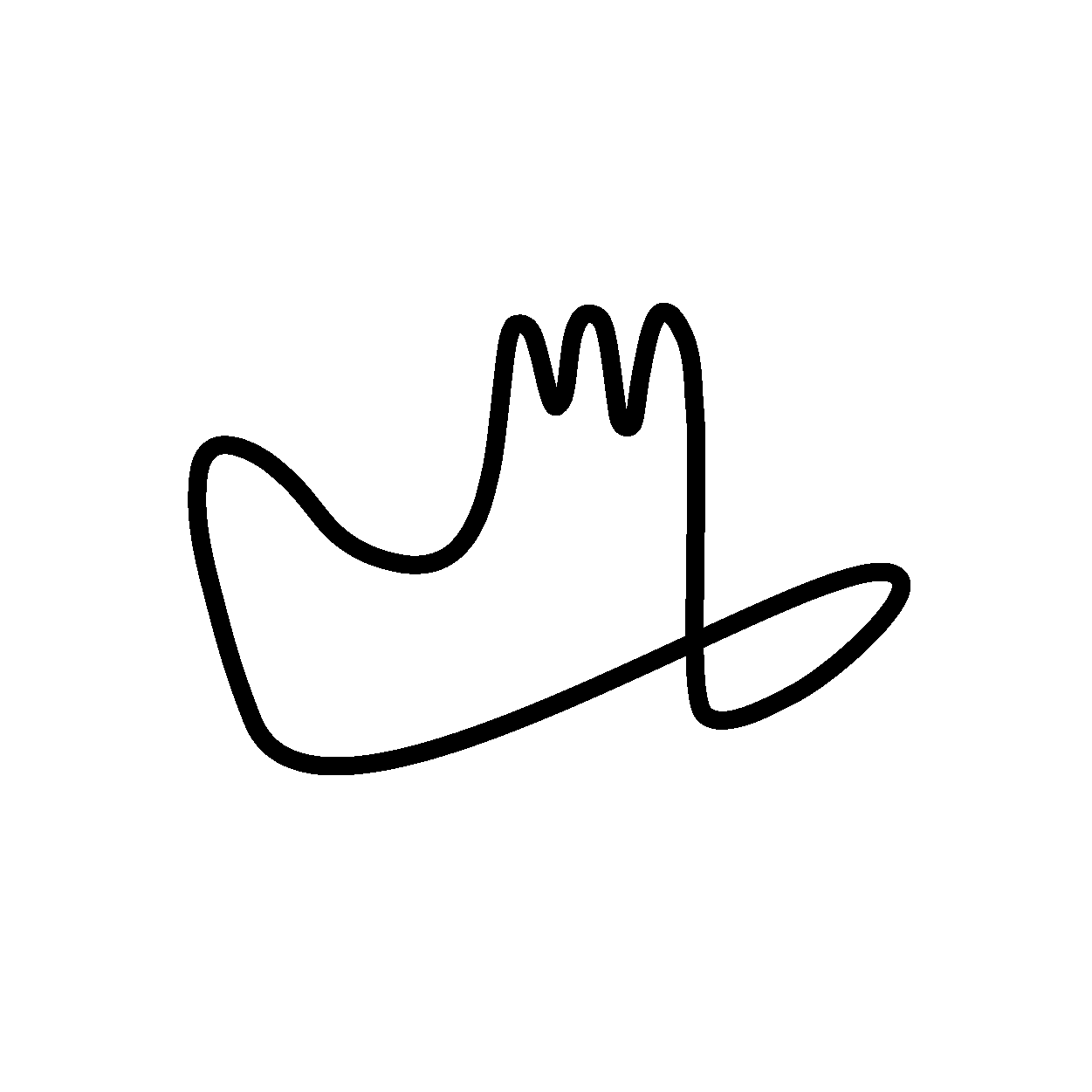
This ideology of course resonates with us and led us down a rabbit hole of internal studies. Can we abstract this cubist concept into one swoop of a pen? Remember those blind contour exercises in art class where you try to draw an object – like your hand – without looking at the pen and without lifting the pen from your page?
Let’s create a logo like that – something that conveys meaning but can be expressed with one swoop of a pen.
Pete: “plus it’s dope that you can make a gang sign out of it!”